The Usability Color Palette
I found I could say things with color and shapes that I couldn’t say any other way – things I had no words for.
-Georgia O’Keeffe
Ms. O’Keeffe could not have said it any better – instant visual impressions are formed through color without any other types of a connection made. Your web design and color palette can affect how individuals perceive you and your brand and your website’s usability.
Different colors correlate to different emotions, as has been discussed by psychologists and businesses for years – big businesses use colors to affect your emotions (and, consequently, your decisions). Brands want to stand out in people’s minds, creating positive associations and making them more likely to recall them in the future. The site and logo should be easily recognizable by your audience and correlated to your service or product library.

Dive into color relationships
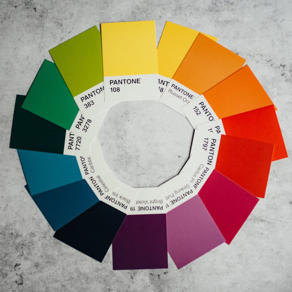
Looking in depth at the color choices for your brand (website, logo and other materials) requires taking a close look at the brand values and goals. Many combinations may be a good fit for an organization and its message. Color relationships are determined by their position on the color wheel.
Complementary colors are pairs that sit directly across each other on the color wheel. allowing for the most dramatic contrast combination.
Analogous colors appear next to each other on the color wheel, lending a harmonious color relationship.
Triadic colors are three colors that are evenly spaced around the color wheel.
Split-complementary elements consist of a base color plus the two colors adjacent to the base color’s complement on the color wheel.

Know Your Terms
Hue
The overarching, discerning quality of color (e.g. “blue”) – the degree to which a stimulus can be described as similar to or different from stimuli that are described as red, green, blue and yellow (known as the unique hues). Orange and purple make up the other hues – a total of red, orange, yellow, green, blue and violet. In painting color theory, hue is a pure color without tint or shade.
Shade
What is obtained when adding black to a particular hue (e.g., dark blue is a shade of blue), resulting in a darker hue?
Tint
Adding white to a particular hue (e.g., light blue is a tint of blue) increases lightness.
Tone
What you get when you add both black and white (grey) to a hue (e.g., pastel blue is a tone of blue)
Saturation
Defined as the range of color beginning with grey (0% saturation) and ending with a pure, gray-less form (100% saturation). Desaturated colors tend to be softer and often duller compared to the more highly saturated colors (that tend toward the vivid). Is it the colorfulness of a color relative to its brightness?
The color schemes of logos and websites influence us from a very early age, creating value and recognition. Evoke emotion with different color schemes – there is a wealth of power in understanding color manipulation. Limit your selection of colors, choosing one color to stand out and vibrate strongly, with one or two muted ones to create a low-contrast harmonious experience. Make sure to create visual harmony by matching text color with a prominent color of images on your site, sustaining a smooth flow for the eye.
~~~
Consider the following questions when deciding upon color schemes:
What kind of feelings does your brand want to evoke?
What colors are competitors using in their branding?
What type of intensity works best with your brand messaging?
How can your color schemes make your brand stand out positively?
Revolutionizing UX Design with the Binary Approach to Project Management
Embracing a clear approach to task completion—where tasks are strictly marked as 'done' or 'not done'—can significantly enhance the efficiency, clarity, and accountability of UX projects. This project management method offers a straightforward…
Human-Centered Design: The Heart of Creating Impactful Digital and Physical Experiences
Whether it be digital, physical, or conceptual, one philosophy consistently emerges as the cornerstone of impactful and effective creation: Human-Centered Design (HCD). At its core, Human-centered design isn’t just a methodology; it’s a…
The Conundrum of Empathy in UX Design: A Driving Force or an Unrealistic Ideal?
Empathy is often touted as the backbone of user experience (UX) design, a tool to perceive and feel what end users might experience. However, the practicality and efficacy of empathy in UX design is a subject of intense debate. While empathy can be…


