- Home
- Interaction
- Approaching a Responsive Strategy With Flat Design
Approaching a Responsive Strategy With Flat Design
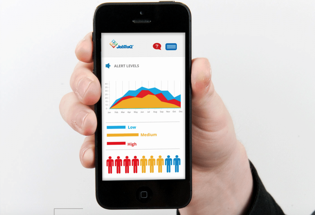
With the prevalence of connected devices in varying sizes and dimensions, the work of interface designers requires a mobile strategy – with responsive web design (RWD) being the optimal route. While responsive design does not require a singular aesthetic, interfaces designed with a flat approach work with a responsive approach must better than many other styles. It’s clear that one of the main reasons flat design has taken shape, beyond usability and the rise of minimalism, is the development of responsive design.
Personified by two-dimensional, clean, smooth, crisp edges and bright colors – flat design could be coined the ‘champion of usability’. Designers who employ flat design identify with a simplified, digital aesthetic, choosing to oppose artificial realism and intricacies in favor of simple iconography.
Designers who embark on a scheme that requires a responsive design and employ the same old styles including fixed imagery, shading and drop shadows quickly realize that these elements and intricacies don’t translate as well as a minimalistic flat-type approach when moving viewpoints into varying sizes.
Flat design helps designers and site owners by affording the design a much faster load time as extra elements are not present and elements are streamlined. Efficiency is key, allowing the faster site to resize and form around the navigation (content, rows and columns) it displays. Additionally, the simple assets are displayed crisper, flowing smoothly when responsive breakpoints are reached with the proliferation of high-def screens.
Though showing boundless benefits, it is important to note that flat design only works in some practices. The brand and content of the organization or product must be aligned with the principles of a minimalistic approach and be prepared to support the pared-down version of their image.
Working with a team who can integrate mobile strategies with flat design, driving content and call to action will help maximize usability and user experience. If thinking about a redesign or responsive strategy, flat design is likely an ideal approach.
Related Articles
Crafting the Perfect Call to Action
December 19, 2023


