Table of Contents
Meeting Users Where They Are: Tailored Layouts for Every Device
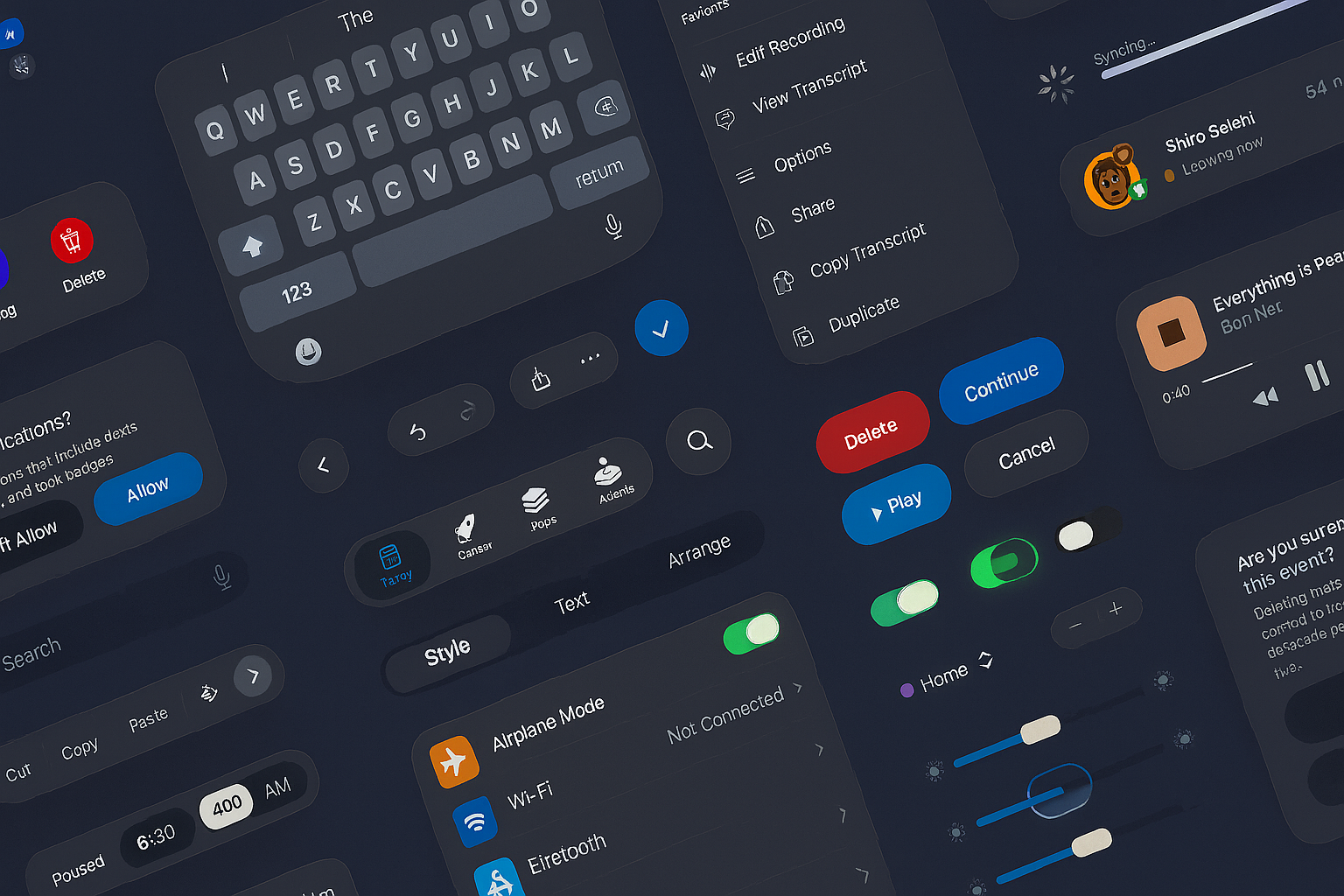
Designing digital experiences now means accounting for varied devices, contexts, connections, and abilities. Because of this diversity, adaptive design has become indispensable rather than optional. Indeed, it offers a way to tailor experiences precisely to each user’s situation. Adaptive design treats the web as a series of distinct contexts. For instance, someone browsing on a phone in a moving car faces different challenges than a person working on a desktop in a quiet office. By crafting separate layouts, designers keep text legible, menus intuitive, and controls smooth—whether via touch or click. Moreover, this approach prevents frustration. Consequently, users enjoy clear, friction-free interactions no matter where they are. While responsive and adaptive strategies both target multiple screens, the latter offers finer control. Specifically, it lets teams decide exactly what shifts at each breakpoint, based on content needs or user habits. In practice, adaptive design complements responsive rules and progressive enhancement techniques to deliver the best of both worlds.
Optimizing Speed and Access
Beyond just visuals, adaptive design boosts performance. For example, lighter images might load on slower connections, and complex animations can be swapped for simpler visuals when needed. Additionally, features can adjust to network speed or input method. As a result, pages load faster and become more accessible to everyone. Testing also improves, since teams can analyze each version’s metrics and refine accordingly. Implementing this approach requires close collaboration among designers, developers, and strategists. They must align on flow, structure, and visual consistency. Otherwise, the user journey risks feeling disjointed when components shift across devices.
Empathy for the Users
Above all, adaptive design starts with empathy. It acknowledges that no two experiences are the same. By meeting inclusive and accessibility standards, it does more than rearrange layouts—it shows genuine care. Therefore, organizations that embrace adaptive methods future-proof their digital presence. As new devices—foldables, wearables, and AR glasses—emerge, their sites won’t just function, they’ll flourish. Ultimately, when users enjoy seamless, personalized experiences, the technology recedes into the background—and that’s the mark of work done right.
Our published articles are dedicated to the design and the language of design. VERSIONS®, focuses on elaborating and consolidating information about design as a discipline in various forms. With historical theories, modern tools and available data — we study, analyze, examine and iterate on visual communication language, with a goal to document and contribute to industry advancements and individual innovation. With the available information, you can conclude practical sequences of action that may inspire you to practice design disciplines in current digital and print ecosystems with version-focused methodologies that promote iterative innovations.
Related Articles –
-
Apple’s New UI Kits for iOS and iPadOS 26: Designing the Future Interface
-

Seamless Human-Computer Interactions: Reducing Cognitive Friction Through Smart Design
-

The Secret Language of Tech Giants: Modern Design Systems
-

Why Using Responsive and Adaptive Design Together May Be the Best Choice
-

Why Using Responsive and Adaptive Design Together May Be the Best Choice
-

Driven By Feedback: Adaptive Web Design
-

Responsive vs. Adaptive Web Design
-
Adapting To Change