Table of Contents
The Backbone of Scalable and Consistent Design
Design systems are not simply style guides or pattern libraries. They are comprehensive frameworks that enable teams to design, build, and maintain digital products with consistency and efficiency. When applied correctly, a system becomes the connective tissue between brand, interface, and user experience—bridging disciplines, scaling operations, and future-proofing the entire design ecosystem.
What Is a Design System?
A design system is a set of standards and reusable components guided by clear documentation that aligns design and development teams across projects. It combines visual styles, UI components, interaction patterns, tone of voice, accessibility principles, and often code repositories. The goal is to ensure that no matter who is working on a product—or how many products are in play—the experience feels cohesive.
Unlike a static brand guideline or a single-use component library, a system evolves. It adapts to changes in the product, shifts in user needs, and advances in technology. It’s a living, breathing foundation that informs every touchpoint of a digital experience.
Why Systems Matter
Consistency isn’t just a visual concern—it directly affects usability and user trust. A well-implemented system reduces redundancy, accelerates production cycles, and minimizes miscommunication between teams. Instead of reinventing solutions for each new screen or product update, teams draw from a shared source of truth.
This consistency also allows brands to scale gracefully. As companies grow—across platforms, markets, and devices—the system provides a unified experience without creating design debt.
Design systems offer benefits beyond efficiency:
-
Accessibility becomes standardized, not optional.
-
Brand identity stays intact across products and platforms.
-
Cross-functional collaboration improves between designers, developers, marketers, and stakeholders.
-
Faster prototyping and development lead to quicker iterations and more informed testing.
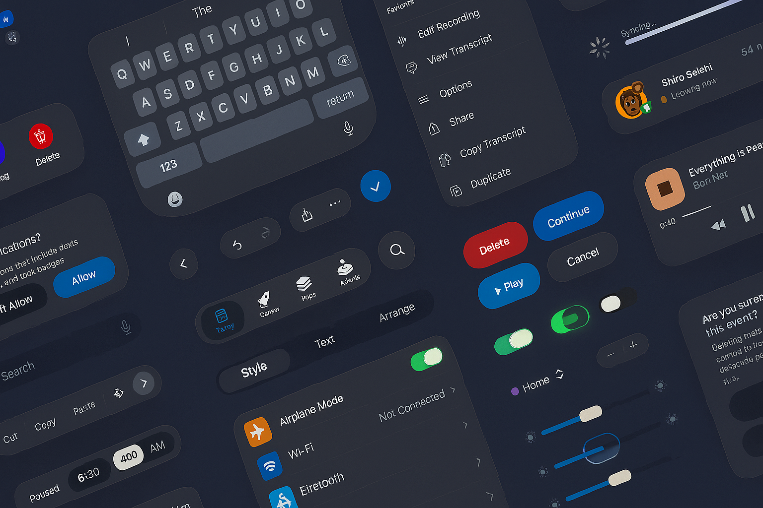
Components of a Design System
A robust system includes both tangible and intangible assets:
-
Design Tokens – The smallest decisions like color codes, spacing, and typography rules that get translated into code.
-
UI Components – Reusable elements like buttons, forms, modals, tooltips, and navigation systems.
-
Patterns – Common interaction models for things like onboarding, authentication, and alerts.
-
Content Guidelines – Voice, tone, grammar usage, and writing standards that ensure consistency in messaging.
-
Documentation – Guides that explain the usage, logic, and evolution of every part of the system.
These components are governed by shared principles—design philosophy, brand values, and user experience standards—that keep the system aligned with its purpose.
Design Systems vs. Component Libraries
A component library is often confused with a design system, but they serve different purposes. A library is a collection of reusable UI elements. A system, on the other hand, provides the context, governance, and scalability around those elements.
While a library may contain the what, the design system defines the how and why. It’s the difference between having ingredients and knowing the recipe.
Building a System: Strategic Approach
Creating a system from scratch—or refining an existing one—requires a strategic and collaborative process. It’s not only about documenting styles or building components but aligning stakeholders on a shared vision.
The process typically involves:
-
Audit: Review existing interfaces, inconsistencies, and redundancies.
-
Define Foundations: Set up the visual language—colors, typography, grids, iconography.
-
Develop Components: Build modular, scalable UI elements with accessibility in mind.
-
Establish Governance: Outline versioning, contribution models, and ownership.
-
Document Everything: Provide transparent documentation with real use cases.
-
Integrate and Iterate: Roll out gradually, gathering feedback and improving with time.
A successful design should be modular, interoperable, and inclusive. It should encourage innovation, not restrict it.
Evolving With the Product
Design systems are not meant to be static. As products evolve, the system must respond. New components may be needed. Old patterns may become obsolete. Trends in accessibility, device behavior, or user interaction may demand new solutions.
Governance is key. Design systems need champions—often called system maintainers—who review new contributions, refine documentation, and foster a culture of design excellence across the organization.
From Startup to Enterprise: A Scalable Asset
Startups benefit from early adoption of design systems because it builds good habits from day one. Enterprise organizations rely on them to coordinate large teams working across multiple products and regions. In both cases, the design system acts as a central nervous system—enabling speed, cohesion, and quality control.
Even companies with long-established brands are realizing that legacy systems without unifying design principles can result in fractured experiences. A well-integrated design system can bring together fragmented product lines under one umbrella, creating a seamless ecosystem for users.
The Role of Technology
Design systems live in platforms like Figma, Sketch, and Adobe XD. On the development side, they often integrate with frameworks like Storybook, React, Angular, or Vue. The best systems bridge the design-to-code gap, offering clarity to both designers and engineers.
Tokens and components should be synchronized between design files and codebases. Built this way become truly integrated—enabling updates to ripple efficiently across every product surface.
More Than a Toolkit—A Culture
Design systems don’t just change how things look. They change how teams think, communicate, and operate. They promote shared ownership of design quality and elevate the maturity of design practice within an organization.
Successful systems are not enforced—they are adopted. When teams understand the why, they’re more likely to contribute, evolve, and protect the integrity of the system.
If you’re building a product—or a portfolio of products—that needs to grow without breaking, a system isn’t optional. It’s foundational. It brings structure to creativity, strategy to execution, and alignment across every screen, user journey, and brand touchpoint.
Our published articles are dedicated to the design and the language of design. VERSIONS®, focuses on elaborating and consolidating information about design as a discipline in various forms. With historical theories, modern tools and available data — we study, analyze, examine and iterate on visual communication language, with a goal to document and contribute to industry advancements and individual innovation. With the available information, you can conclude practical sequences of action that may inspire you to practice design disciplines in current digital and print ecosystems with version-focused methodologies that promote iterative innovations.
Related Articles –
-
Apple’s New UI Kits for iOS and iPadOS 26: Designing the Future Interface
-

Design Debt: What It Is and Why It Slows Down Innovation
-

UI Design for a Modern Website
-

Beyond Aesthetics: 5 Pillars of Effective Web Design Today
-

Designing UI for Visceral Responses
-

When Visual UI/UX Is Not Enough
-

The Secret Language of Tech Giants: Modern Design Systems
-

Design Systems and AI Technology
-

When Functionality Drives a Refresh of Visual Language
-
The Power of Unified Design Language