Table of Contents
Palette: A Design Tool of Emotional Precision
A palette is more than a collection of colors. It’s a carefully chosen system that reflects intention, evokes feeling, and supports functionality across a brand or product. Whether in physical media or digital experiences, the palette anchors visual identity and shapes user behavior. Furthermore, it sits at the intersection of aesthetics, accessibility, and strategy—serving as both a guide and a constraint.
More Than Color: The Palette as a System
In design, a palette refers to the curated range of colors a brand, product, or interface uses to communicate. However, it’s not just about visual harmony. A palette defines hierarchy, enables consistency, and fosters emotional alignment. It includes primary colors, secondary tones, neutrals, accents, and often contextual variations such as dark mode adaptations or seasonal shifts. When used well, a palette doesn’t just decorate—it informs.
Designers don’t build palettes randomly. Instead, they develop them through a process of intention, testing, and refinement. A strong palette must do multiple jobs: support readability, reinforce mood, distinguish interface states, and align with the underlying brand tone. This multidimensional role is why palette design often begins with research, cultural context, accessibility standards, and even psychological profiling of intended audiences.
Psychological Anchors and Emotional Response
Palettes tap into the deep associations we carry with color. For instance, warm hues can energize, cool tones can calm, muted schemes may feel sophisticated, and vibrant combinations might express innovation or rebellion. Yet, the interpretation of color is never universal. Cultural differences shape perception—red signifies celebration in one region and caution in another.
The job of a designer is not to guess but to know. This means considering the brand’s personality, its desired emotional impression, and how it wants people to feel in response. For example, a healthcare brand might lean into blues and greens for trust and calm, while a tech startup may opt for high-contrast electric tones to signal dynamism. Ultimately, the palette becomes an emotional language.
Accessibility and Function in Color Choices
A palette must serve everyone. Accessibility considerations demand that color combinations meet contrast ratios, avoid reliance on color alone for meaning, and remain legible across devices and lighting environments. Tools like WCAG (Web Content Accessibility Guidelines) provide technical standards. Nevertheless, inclusive design requires more than compliance—it calls for empathy.
An accessible palette supports interaction. Button states must be distinguishable. Text must remain readable against any background. In addition, error messages must stand out, not blend in. These are not style choices—they are functional design decisions that directly affect usability.
When crafting palettes, designers test foreground/background pairs, simulate various types of color blindness, and explore combinations that preserve clarity in grayscale. The goal is to ensure that no one is left out due to poor visual contrast or inaccessible color use.
Palette in Branding: From Recognition to Memory
Color builds memory. Think of the red of Coca-Cola, the blue of Facebook, or the purple of Cadbury. These associations didn’t happen by accident—they were nurtured over time through consistent, purposeful use.
A brand’s palette is one of its most instantly recognizable features. When deployed across print, packaging, web, environments, and motion, color reinforces identity. However, this requires discipline. Deviating from the palette, even slightly, can dilute brand equity. Thus, consistency becomes a strategic tool.
Design systems often include detailed color specifications: HEX, RGB, CMYK, and Pantone values; background/foreground use rules; and context-specific variations. These systems enable scalable design, especially for distributed teams working across platforms.
Consistency doesn’t mean stagnation. Palettes evolve. Brands may expand a core palette with seasonal or campaign-specific extensions—what some call “color stories”—to allow creative flexibility without losing coherence.
Palette in the Digital Environment
In digital interfaces, palette plays a critical role in usability and interactivity. It guides the eye, creates rhythm, and communicates hierarchy. Designers use color to signal affordances—like clickable buttons or interactive hover states—and to distinguish between functional areas of a screen.
Light and dark themes demand separate but coordinated palettes. Moreover, responsive design requires palettes to look good across different screen types and ambient light conditions. With design tokens becoming standard in modern UI systems, color values are now encoded into reusable variables, allowing global control of the palette with efficiency and precision.
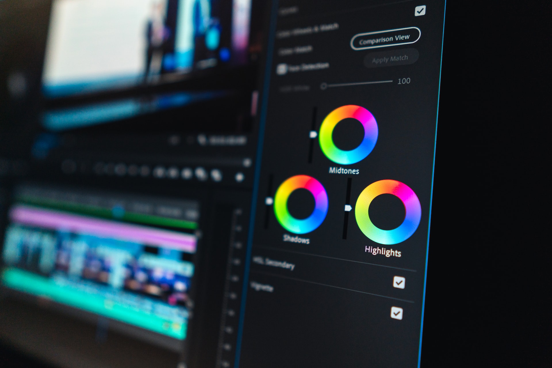
A digital palette also interacts with motion, animation, and data visualization. Animated transitions may shift tints and shades. Similarly, charts may require diverse, distinguishable colors for clarity. Ultimately, the palette becomes an orchestrator of digital behavior.
Curating a Palette: From Strategy to Execution
Creating a palette begins with purpose. What is this interface, brand, or product trying to say? Who is it speaking to? What feeling should it leave behind?
From there, designers test and create mood boards, build scenarios, and develop prototypes to iterate. They evaluate the palette under various lighting conditions and devices. Alongside these evaluations, they test contrast, run accessibility checks, and gather feedback. Eventually, they document the results in a design system that defines usage and protects integrity.
Some teams begin with a single hero color and build around it. Others start from imagery, environmental context, or competitive landscape analysis. Either way, the palette emerges as a refined framework—both expressive and functional.
A Palette is Never Just Color
A well-crafted palette is a quiet force. Building trust without drawing attention to itself, a palette anchors interfaces, clarifies meaning, supports emotional goals, and ensures visual inclusivity. It also works in harmony with typography, layout, shape, and interaction to form a complete visual language.
Designers often treat color as instinctive. However, great palettes are deliberate. They result from strategic thinking and iterative testing. In the hands of skilled creators, a palette becomes more than a color chart—it becomes a foundation of perception and experience.
Our published articles are dedicated to the design and the language of design. VERSIONS®, focuses on elaborating and consolidating information about design as a discipline in various forms. With historical theories, modern tools and available data — we study, analyze, examine and iterate on visual communication language, with a goal to document and contribute to industry advancements and individual innovation. With the available information, you can conclude practical sequences of action that may inspire you to practice design disciplines in current digital and print ecosystems with version-focused methodologies that promote iterative innovations.