Table of Contents
Revisiting the Color Wheel: From Theory to Practice
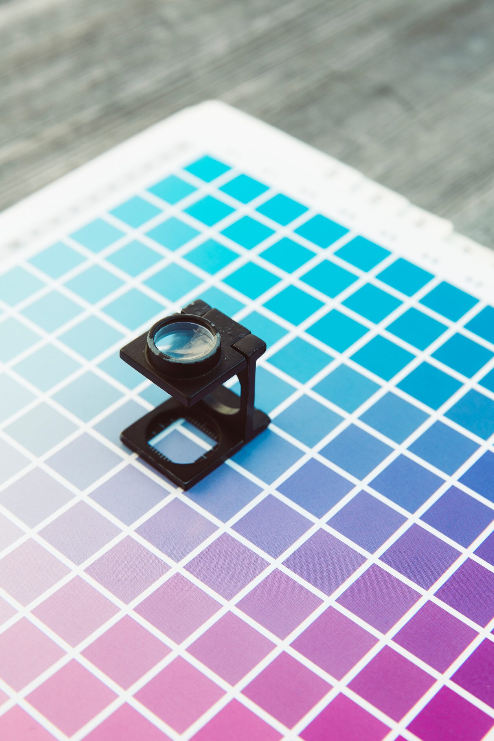
The color wheel is one of the first visual tools introduced to us in school. At the time, it may have seemed simple—just a circle divided into slices of color. But for anyone working in design, branding, or visual communication, the color wheel remains one of the most practical tools for decision-making. It’s not just a lesson in theory; it’s a framework that informs how we approach color in real-world design scenarios.
What We Learned: Primary, Secondary, and Tertiary Colors
Early education introduced us to the basic structure of the color wheel:
-
Primary colors: Red, blue, and yellow—colors that cannot be made by mixing others.
-
Secondary colors: Green, orange, and purple—created by mixing two primary colors.
-
Tertiary colors: The six colors formed by mixing a primary with a neighboring secondary (like red-orange or blue-green).
These basics helped us understand relationships between colors, setting the stage for more complex concepts like temperature, harmony, and contrast.
Warm vs. Cool Colors
We also learned that colors have temperature. Warm colors—reds, oranges, and yellows—evoke energy, excitement, and attention. Cool colors—blues, greens, and purples—convey calm, serenity, and professionalism. While this may have sounded poetic in theory, in practice, this distinction plays a role in guiding emotional tone and brand perception.
Designers use color temperature to direct focus, shape mood, and create visual hierarchy. A warm call-to-action button against a cool background grabs attention. A cool brand palette for a healthcare company reinforces trust and composure.
Complementary and Analogous Colors
In school, the teacher might have had us spin the color wheel to find complementary colors—those directly across from each other (like blue and orange, red and green). These create vibrant contrast and are commonly used to generate visual tension and balance.
We also learned about analogous colors, or those adjacent on the wheel (like blue, blue-green, and green). These create harmonious, unified visuals. While complementary schemes are great for high contrast and bold statements, analogous palettes are often used for softer, more cohesive compositions.
Designers apply these pairings to ensure legibility, tone control, and consistency—especially across digital platforms, packaging, or environmental graphics.
Split-Complementary, Triadic, and Tetradic Schemes
As we advanced, the color wheel revealed more complex harmonies:
-
Split-complementary uses a base color and the two adjacent to its complement. It balances contrast with harmony.
-
Triadic color schemes use three colors evenly spaced around the wheel, offering vibrant combinations that maintain balance.
-
Tetradic (double complementary) involves two pairs of complementary colors—rich, but trickier to master without overwhelming the viewer.
These combinations allow designers to craft bold, dimensional palettes that go beyond the basics—especially when working with brand identities, user interfaces, or large-scale visual systems.
Hue, Saturation, and Value: Where It Gets Practical
Design software introduced us to more than just color names. It made us work with hue, saturation, and value (HSV). This gave us precision.
-
Hue is the actual color (red, blue, green).
-
Saturation is the intensity or purity of the color.
-
Value (or brightness) determines how light or dark the color appears.
Understanding these helps designers achieve subtlety. For instance, dialing down saturation to create a muted tone can lend a premium feel, while adjusting brightness can help maintain accessibility across light and dark backgrounds.
Accessibility and Contrast Ratios
Here’s where school didn’t prepare us enough. The color wheel didn’t teach us about compliance, contrast ratios, or how users with low vision perceive color.
In real-world practice, a beautifully chosen palette can fall apart if it’s inaccessible. That’s why tools like contrast checkers and WCAG guidelines are now part of the designer’s toolkit. We still use the color wheel to build palettes, but we test our choices to ensure they serve all users.
Cultural and Emotional Context
Color theory in school was mostly aesthetic and scientific. In practice, it becomes cultural and contextual.
Red might mean love or urgency in one context, but signal danger or warning in another. White is purity in some cultures and mourning in others. When working globally—or even across industries—these nuances matter.
Designers and brand strategists use the color wheel not just to find pleasing combinations but to match tone and meaning to audience expectations.
Digital Design and Modern Tools
The modern digital workflow has turned the static color wheel into an interactive, dynamic tool. From Figma and Adobe to online color palette generators, the wheel is now coded into platforms we use every day.
Designers use these tools not just to pick colors but to simulate lighting, theme variations, and accessibility modes (light/dark). The color wheel has grown into something layered—with brand palettes, variable modes, and component-based styling all linked to underlying color logic.
Why We Still Use It
Despite its simplicity, the color wheel is far from outdated. It’s a flexible foundation—a framework we return to every time we:
-
Start a new branding project
-
Build UI themes for apps
-
Adjust styles for accessibility
-
Refine packaging or print layouts
-
Present moodboards to clients
It helps ensure consistency. It anchors creative choices in logic. And it’s a bridge between instinct and strategy.
Conclusion
We may have first encountered the color wheel while coloring in worksheets or painting primary hues on poster board. But today, we use it to influence perception, guide decisions, and shape systems. What was once a learning tool has become an indispensable part of professional design—proving that sometimes, the simplest tools are the ones we never outgrow.
Our published articles are dedicated to the design and the language of design. VERSIONS®, focuses on elaborating and consolidating information about design as a discipline in various forms. With historical theories, modern tools and available data — we study, analyze, examine and iterate on visual communication language, with a goal to document and contribute to industry advancements and individual innovation. With the available information, you can conclude practical sequences of action that may inspire you to practice design disciplines in current digital and print ecosystems with version-focused methodologies that promote iterative innovations.