Table of Contents
The Role of Color in Design
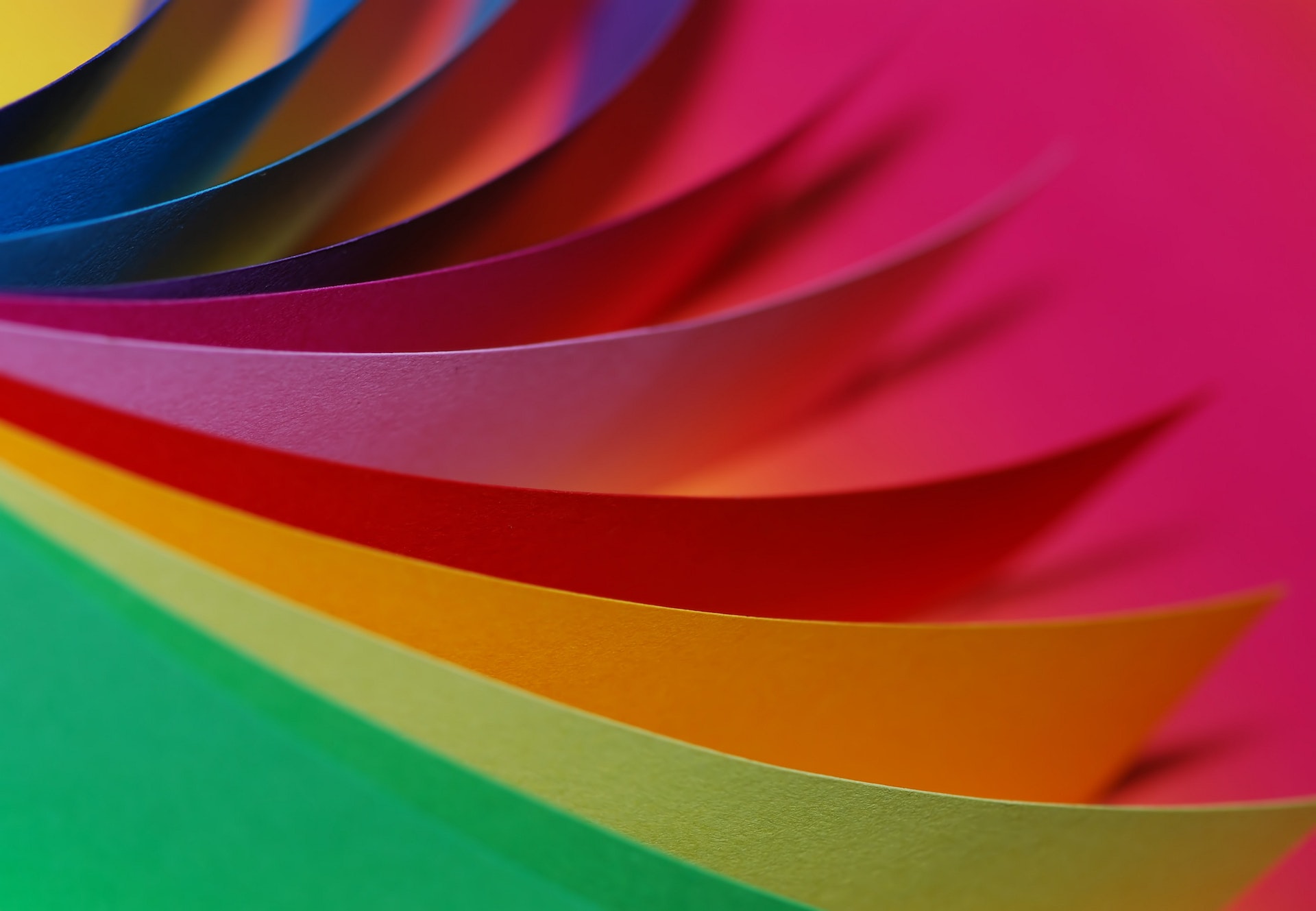
Color in design is never an afterthought. It’s one of the most immediate elements users notice—and one of the most powerful tools a designer has. Whether applied to a website, product packaging, or branding system, visual tone communicates faster than text. It signals intent, sets the mood, and influences perception—all within milliseconds.
Design is both seen and felt. And one of the most intuitive ways people feel design is through color. Used well, it creates hierarchy, improves usability, and amplifies emotion. Misused, it causes confusion or alienates users. The way we implement tone choices says as much about the message as the words or layout.
The Psychology of Visual Tone
Visual tone isn’t just decoration—it’s emotion. Red feels urgent. Blue feels trustworthy. These responses aren’t universal, but they’re consistent enough to influence behavior. Designers harness this emotional language to direct attention, suggest pace, or evoke familiarity.
But interpretation varies across cultures and contexts. White symbolizes purity in some countries and mourning in others. The takeaway: effective tone selection must consider audience expectations, regional associations, and emotional nuance.
Color in design becomes more powerful when it’s rooted in empathy. It’s about anticipating how people feel when they interact—not just how something looks.
Perception and Context
The way we perceive tone is shaped by more than light and retina. It’s about contrast, proximity, and surrounding elements. A hue never lives in isolation. A cool green may appear vibrant next to black but washed out beside yellow. This phenomenon—simultaneous contrast—requires that designers test hues in real-world contexts.
Different lighting environments, display calibrations, and user settings affect how colors are seen. So the goal is not just to select attractive combinations, but to ensure that visual information holds up in every environment—bright daylight, grayscale screens, or dark mode.
In interface design, color must work under pressure. Clarity is essential, and predictability matters. Users won’t analyze tone—they’ll just respond to it.
Accessibility and Contrast
Effective use of tone requires more than taste. It demands responsibility. If meaning is conveyed only through hue, users with low vision or color blindness may miss critical cues. That’s why accessibility standards, like WCAG, outline contrast ratios and discourage color-only distinctions for important content.
Buttons, alerts, and navigation elements must remain readable and distinguishable, even without hue. That means pairing tone with text, shape, or icons. A red outline alone doesn’t help a color-blind user understand a form error—an icon or label should do the heavy lifting.
Inclusive design isn’t just ethical—it’s practical. Strong contrast benefits everyone: users outdoors, those on older devices, and even those glancing quickly. Color in design becomes more impactful when it serves clarity, not just style.
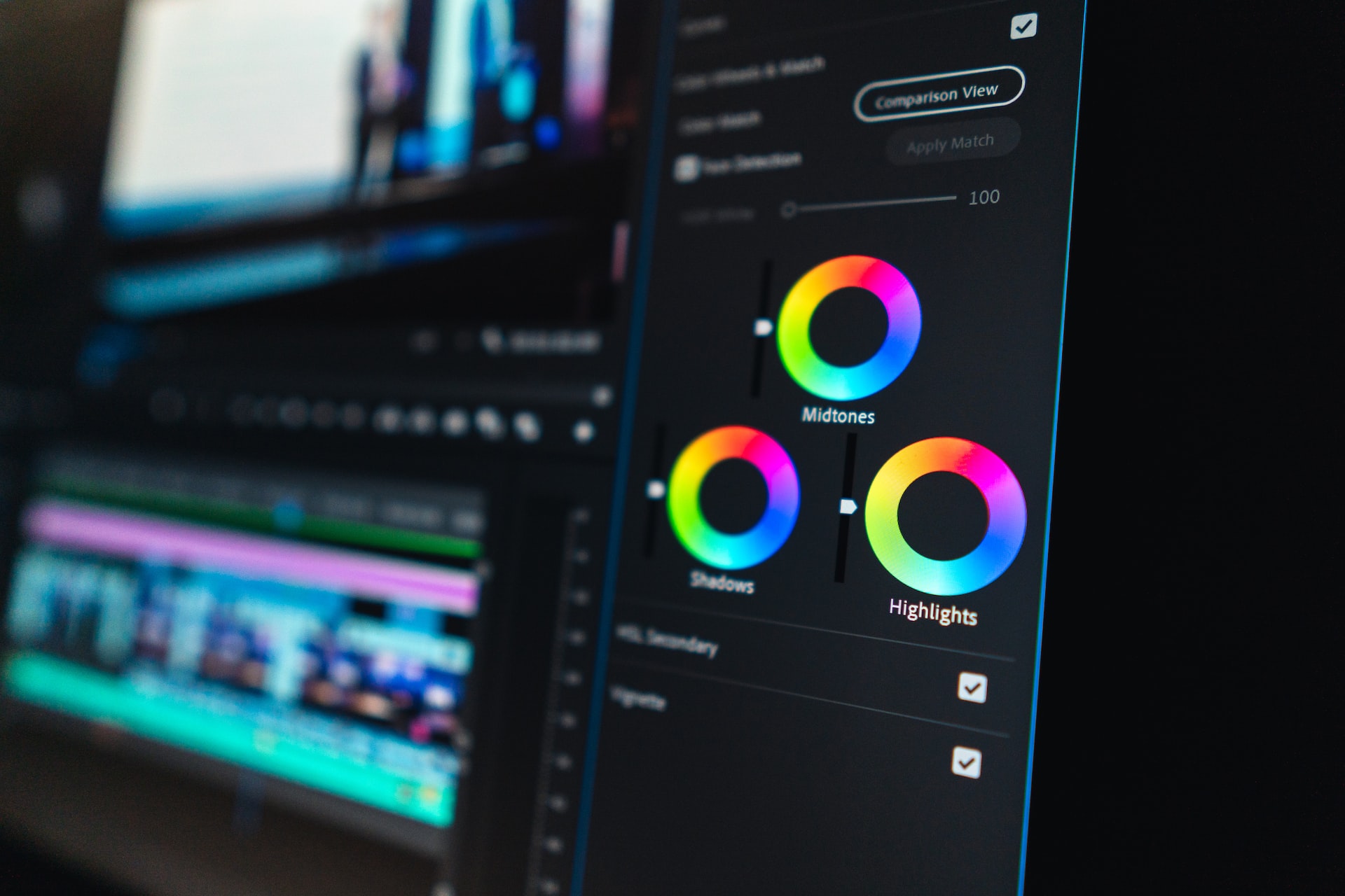
Systems and Structure
To maintain consistency across evolving platforms, designers rely on structured palettes. These aren’t just collections of swatches—they’re functional frameworks. A well-developed color system defines tone roles: primary actions, background layers, warning indicators, and secondary elements.
Instead of memorizing hex codes, teams think in roles: “success state,” “alert,” “secondary text.” This enables consistent use across platforms and allows design systems to adapt to theming, light/dark modes, and accessibility upgrades.
Well-defined systems empower better decision-making, reduce production errors, and speed up implementation across teams and tools.
Interaction and Feedback
Tone becomes dynamic in interactive environments. Hover states, tap animations, active highlights—all depend on shifts in visual treatment. These feedback cues give users orientation and reinforce the system’s logic.
For instance, a subtle fade from gray to blue can imply interactivity. A flashing yellow may suggest caution. A green checkmark affirms success. In all these cases, motion combined with tone strengthens the interface’s clarity.
The best experiences guide users invisibly. They don’t explain the interface—they reveal it. Tone plays a central role in those micro-moments that make digital products feel intuitive.
Cultural Significance
Every market brings unique expectations. The hues chosen for a fintech app in Germany may not resonate with users in Brazil. While global platforms often lean toward neutral, versatile palettes, local relevance can’t be ignored.
Some industries, like health or finance, have established visual norms—clean blues, soft greens, neutral grays—that users associate with safety or professionalism. Departing from those norms isn’t wrong, but it must be done intentionally.
That’s why color in design should always serve the brand’s voice, industry tone, and user needs. Originality only succeeds when it’s supported by relevance.
Practical Palette Building
Creating a palette involves more than choosing colors that look good together. It requires planning for scalability, adaptability, and harmony. A strong palette includes:
-
Core brand tones for identity and emotion
-
Functional hues for buttons, states, and navigation
-
Neutrals and background layers for structure
-
Accents for emphasis and storytelling
Good palettes evolve. Startups may launch with three tones. As products grow, that system may expand to support multiple applications, accessibility enhancements, and new audience segments.
Tools like Adobe Color, Figma variables, or web contrast checkers help validate color relationships. But the real test is how the design performs in practice: across devices, formats, and user behaviors.
Building Brand Recognition
Ask someone to describe Spotify, Tiffany & Co., or YouTube. The answer often starts with their signature hue. Strong branding depends on visual memory, and nothing is more memorable than a consistent tone identity.
But repetition alone isn’t enough. Color must be reinforced across the interface—buttons, icons, hover states, illustrations. Fragmented use reduces brand strength. Unified application builds recognition, trust, and recall.
For growing brands, color is a shorthand for personality. It becomes a user’s first impression and lasting association.
Adapting and Evolving
As user needs shift, so must design systems. A color palette that once served a desktop site may fall short on mobile. A bright hue may need muting for dark mode. A brand may require rethinking tone choices to meet new accessibility goals or reflect updated values.
Revisiting visual systems should be part of any healthy design process. Consistency isn’t about rigidity—it’s about continuity through change.
At VERSIONS®, we believe iteration is a strength. The most effective use of color in design happens not once—but over time, as needs, platforms, and users evolve.
Final Thought
Design is about communication. And color is one of the fastest, most intuitive ways to speak. When chosen with care, it creates clarity. When deployed with consistency, it builds identity. And when supported by strategy, it makes experiences more inclusive and more memorable.
For designers, color is not just a tool. It’s a responsibility.
Our published articles are dedicated to the design and the language of design. VERSIONS®, focuses on elaborating and consolidating information about design as a discipline in various forms. With historical theories, modern tools and available data — we study, analyze, examine and iterate on visual communication language, with a goal to document and contribute to industry advancements and individual innovation. With the available information, you can conclude practical sequences of action that may inspire you to practice design disciplines in current digital and print ecosystems with version-focused methodologies that promote iterative innovations.
Related Articles –
-

Using Colors in UI to Enhance User Experience and Minimize Frictions
-

Choosing the Best Colors for an Exceptional User Experience
-

Designing Meaning: How UI Elements Create the Narrative of Digital Experience
-

Design Language: A Journey Through Culture, Method, and Human Cognition
-
The Power of Color Psychology for Effective Web Design
-

Color Theory from the Digital Perspective
-

The Subtle Fundamentals of UI Design
-
The Usability Color Palette