Table of Contents
Designing Responsive and Intuitive Interfaces
Feedback in user interface (UI) design is not just a courtesy—it’s a fundamental mechanism that keeps users informed, reassured, and engaged. It bridges the interaction between user intention and system response. When designed effectively, response enhances trust, confidence, and clarity. When absent or inconsistent, it leads to confusion, errors, and abandonment.
What is Feedback in UI?
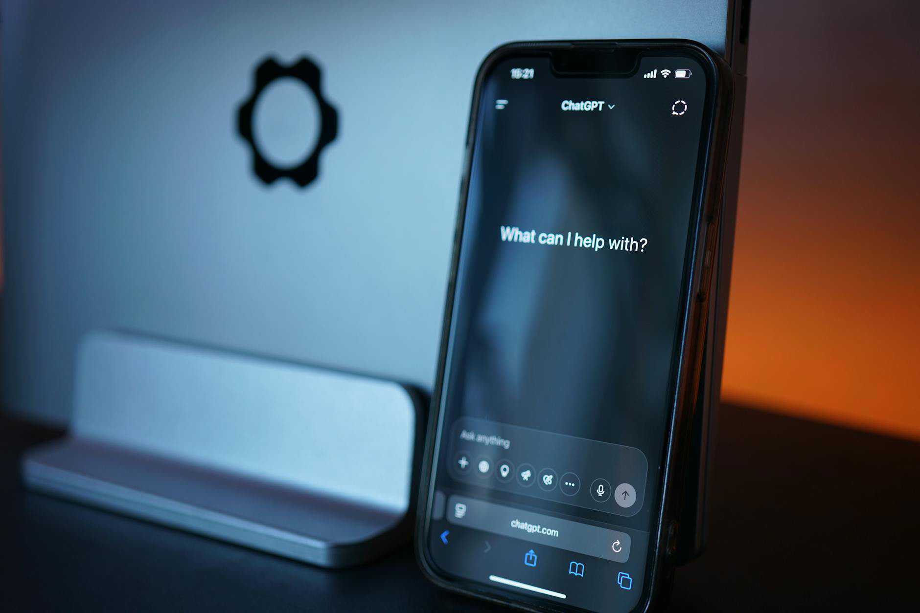
Feedback in UI refers to any visual, auditory, or tactile signal that communicates the result of a user’s interaction with a digital interface. Whether it’s clicking a button, submitting a form, dragging a file, or waiting for content to load—feedback gives users a sense of control and acknowledgment.
There are several types of responses:
-
Visual (e.g., button color change, progress bars)
-
Auditory (e.g., a notification sound)
-
Haptic (e.g., vibration on mobile)
Each form plays a role in making digital interactions feel real and reciprocal.
The Psychology of Feedback
At its core, feedback satisfies a basic cognitive need: confirmation. Users expect systems to reflect their actions—especially when those actions have consequences. Immediate and relevant response helps users build mental models about how the interface works. This reduces cognitive load and increases satisfaction.
Positive feedback loops reinforce correct behavior. Negative feedback, when clear and respectful, helps users recover from errors. Ambiguous or missing response leaves users feeling lost.
Microinteractions and Feedback
Microinteractions—like toggles, hover effects, swipe gestures, or status updates—are moments where response is most critical. They often go unnoticed when working well but immediately stand out when poorly executed.
For example:
-
A subtle hover state signals that a button is clickable.
-
A loading spinner reassures users their input is being processed.
-
A toast notification confirms that a file has been uploaded.
Each of these micro moments creates a continuous dialogue between user and system. They may be small in scale, but collectively, they define the experience.
Error Feedback and Recovery
A particularly important category is error feedback. Good error messages don’t just tell users something went wrong—they guide them toward resolution.
Effective error response should:
-
Be specific (“Password must include one uppercase letter.”)
-
Be visible and timely (appearing close to the input)
-
Use friendly and human language
-
Offer next steps (“Try resetting your password.”)
This isn’t just a technical issue—it’s a user experience issue. Poor error feedback punishes users for mistakes. Good error response empowers them to move forward.
Timing and Responsiveness
Feedback must be delivered at the right time. A delayed response can be worse than no response at all. Users expect immediate acknowledgment—even if the action itself takes time.
In cases where processing takes longer than a second, UI should introduce a loading indicator. For longer delays, progress bars or status updates maintain engagement. If an action is completed quickly, an immediate visual cue—even a slight animation—should follow.
Responsiveness doesn’t just relate to speed; it reflects empathy in design. The interface must “listen” and “speak” in rhythm with the user.
Feedback and Accessibility
Feedback must also be accessible. For users with disabilities, visual cues alone may not suffice. Screen readers should announce state changes. Animations should be subtle and non-distracting. Haptic and audio feedback should complement, not replace, visual cues.
Inclusive feedback design ensures everyone gets the same quality of communication, regardless of ability or device.
Designing Feedback Systems
Designing for feedback means anticipating what the user needs to know—and when. A consistent feedback system includes:
-
Affordances: Visual cues that suggest possible actions (e.g., shadows on buttons)
-
Confirmations: Acknowledgment of actions taken (e.g., checkmarks, animations)
-
Status indicators: Informing users about ongoing processes (e.g., syncing, saving)
-
Alerts: Signaling changes, warnings, or new information
Each of these elements should be purposeful and coherent within the design language. Overuse can become noise; underuse can cause silence.
Feedback is a Conversation
Ultimately, feedback is a dialogue—not a monologue. It respects the user’s input and replies with relevant, timely, and understandable responses. It’s not just about showing something happened—it’s about showing that the system cares that something happened.
Great interfaces feel like conversations. When users click, scroll, swipe, or submit, they’re talking to the system. The system’s response—its feedback—should feel like it’s listening, understanding, and responding with intention.
As designers, we shape that dialogue. Thoughtful feedback is what makes an interface feel alive, respectful, and intuitive. It’s how we build trust, one interaction at a time.
Our published articles are dedicated to the design and the language of design. VERSIONS®, focuses on elaborating and consolidating information about design as a discipline in various forms. With historical theories, modern tools and available data — we study, analyze, examine and iterate on visual communication language, with a goal to document and contribute to industry advancements and individual innovation. With the available information, you can conclude practical sequences of action that may inspire you to practice design disciplines in current digital and print ecosystems with version-focused methodologies that promote iterative innovations.
Related Articles –
-

Why Great Products Still Fail: The Overlooked Roles of Acceptability and Adaptability
-
Designing Better UX for AI Applications
-

Solution Is Only as Valuable as the Problems It Solves
-

Building Better AI Interfaces
-

Where Most AI Apps Get It Wrong
-

Organize Your Usability Workshop
-

Signals We Give to Users: Designing with Intention
-

Feedback Loops: The Engine Behind Meaningful Design Iteration
-

Usability Testing for AI Interfaces: How to Test What Users Don’t Understand
-

Guesswork or Science: The Divide That Defines Outcomes in Design