
Table of Contents
Simplicity as Function
Flat design emerged as a response to overly ornamental interfaces of the early web, where gradients, shadows, and textures tried to simulate physical depth on screen. Today, it represents a mature visual language grounded in clarity, function, and digital-native aesthetics. As designers, we use flat graphical treatments not just for its looks but for the purpose it serves—creating interfaces that are clean, accessible, and optimized for responsiveness.
What Is Flat Design?
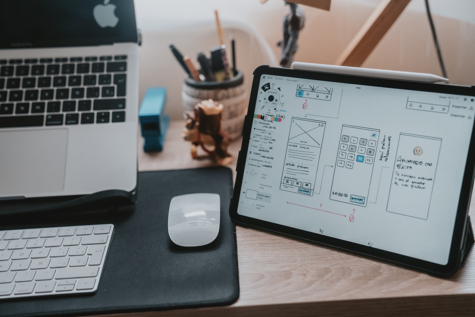
Flat design is a minimalist approach to interface design that strips away stylistic illusions of three-dimensionality. There are no bevels, no drop shadows, no mimicked textures. Instead, embraces two-dimensional elements, bold color palettes, simple typography, and intuitive iconography.
This design philosophy values content over chrome. By minimizing visual distractions, it allows the core message, functionality, or action to take center stage.
Why Flat Design Works in Digital Interfaces
Flat design aligns with the very nature of digital devices. Screens are flat. Pixels are flat. The illusion of depth was a legacy of skeuomorphic design, used to help users understand digital interfaces by referencing real-world objects. But as digital fluency increased, users no longer needed visual metaphors to navigate a screen.
Flat design works because:
-
It improves performance. Fewer graphic effects mean faster load times.
-
It scales easily. Simplified elements translate well across screen sizes and resolutions.
-
It supports accessibility. Clean type and high contrast palettes are easier to perceive.
-
It focuses attention. By removing embellishment, flat interfaces sharpen the user’s focus on content and tasks.
Key Characteristics of Flat Design
-
Typography as a design element
Flat graphics often uses bold, sans-serif fonts with tight typographic hierarchies. The clarity of type becomes a primary navigational and visual cue.
-
Color blocking and vibrant hues
Strong color palettes help segment content and guide attention. Designers often pair primary colors with neutrals or pastels to balance contrast and rhythm.
-
Simple iconography
Icons are flat, line-based, or filled with solid colors. They avoid drop shadows or gradient fills and rely on universal shapes to indicate actions or categories.
-
Minimal UI elements
Buttons, cards, forms, and navigations are reduced to their most functional form. Borders, padding, and whitespace define their presence.
-
Focus on usability
Every visual element serves a purpose. There’s no decoration for decoration’s sake. If something is on the screen, it has a clear reason for being there.
Evolution into Flat Design 2.0
Despite its strengths, early flat design had limitations. Removing all dimensionality could hinder usability—buttons didn’t look clickable, interfaces lacked affordances. This led to a refined approach often referred to as Flat 2.0 or semi-flat.
Flat 2.0 reintroduces subtle shadows, gradients, and layering—but only as cues for interactivity, not decoration. The aesthetic remains minimal, but with microdepths that help users orient themselves in a digital environment.
Flat Design and Brand Expression
Flat design is often mistakenly perceived as visually neutral. In reality, it offers a strong foundation for brand expression. Because of its restraint, every visual decision—color, shape, type—carries more weight.
Brands can express themselves powerfully through flat design by:
-
Leveraging a custom icon or illustration system
-
Using distinctive color combinations
-
Creating unique UI shapes or frames
-
Building strong typographic presence
Flat design does not mean bland design. It invites intentionality.
Flat Design and UX
From a UX perspective, flat interfaces demands precision. When we remove visual cues, we must compensate with hierarchy, clarity, and consistency. The placement, spacing, and interaction behavior of every element become more important.
Flat design works best when combined with strong UX practices:
-
Clear call-to-actions
-
Logical content grouping
-
Predictable navigation
-
Mobile-first responsiveness
-
ADA and WCAG compliance
Where Flat Design Excels (and Where It Doesn’t)
Best suited for:
-
Mobile-first applications
-
Content-heavy websites
-
SaaS dashboards
-
Minimalist brands
-
Modern digital portfolios
Challenges arise when:
-
The product relies heavily on visual hierarchy but lacks UX planning
-
Over-minimalism reduces usability
-
Interactivity is unclear without micro-interactions
Flat design should never be applied blindly. Like any design language, it must serve the user, the brand, and the interface.
Our published articles are dedicated to the design and the language of design. VERSIONS®, focuses on elaborating and consolidating information about design as a discipline in various forms. With historical theories, modern tools and available data — we study, analyze, examine and iterate on visual communication language, with a goal to document and contribute to industry advancements and individual innovation. With the available information, you can conclude practical sequences of action that may inspire you to practice design disciplines in current digital and print ecosystems with version-focused methodologies that promote iterative innovations.