Table of Contents
Infographics in Design: Communicating Complex Ideas with Visual Clarity
Infographics are a powerful form of visual communication that combine data, design, and storytelling. In both digital and print formats, they serve as an effective medium to condense complex ideas into easily digestible visuals. Whether used in presentations, user interfaces, reports, or content marketing, infographics improve comprehension, increase retention, and support engagement.
They are not just charts or decorative elements; they are strategic tools for translating information into meaning.
What Makes an Infographic Effective?
An effective infographic balances clarity with visual appeal. It simplifies without oversimplifying. Instead of overwhelming users with dense paragraphs or data tables, it guides their attention through hierarchy, contrast, and composition.
Key elements of a successful infographic include:
-
Clear narrative flow: The layout should guide the viewer from start to finish in a logical sequence.
-
Prioritized information: Essential content is emphasized, while supplementary data supports the story.
-
Visual hierarchy: Typography, color, and scale are used intentionally to direct attention.
-
Accurate representation: Charts and visuals must reflect true relationships without distortion.
-
Design consistency: Repeating patterns, iconography, or grid structures maintain visual unity.
Infographics vs. Data Visualization
While both are forms of visual communication, data visualizations tend to present raw data through graphs or charts, often interactively. Infographics, on the other hand, typically integrate narrative and context—offering analysis, summaries, or insights alongside visualized data. They are curated experiences, not just plotted numbers.
Infographics are ideal when:
-
You’re telling a story or making an argument
-
The content benefits from structure or sequence
-
Audiences need context before they interpret data
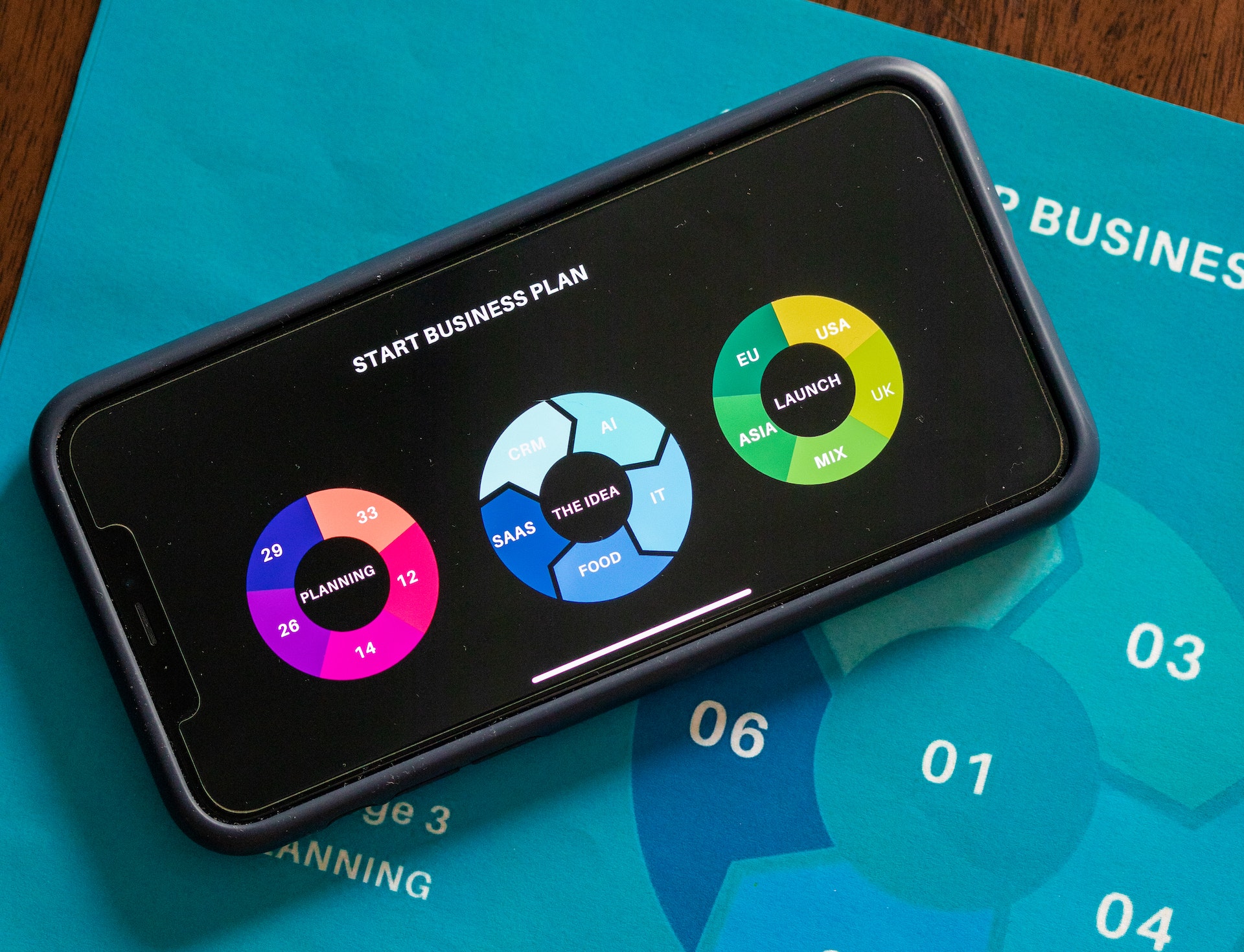
Infographics in UI and UX Design
In digital interfaces, infographics support understanding by:
-
Summarizing onboarding steps or service explanations
-
Visualizing user journeys or workflows
-
Displaying real-time stats or performance indicators
-
Enhancing dashboards with intuitive visual feedback
They reduce cognitive load and bridge the gap between abstract data and real-world relevance. In UX, this creates clarity, drives action, and improves recall.
Motion Infographics for Web Storytelling
While static infographics are powerful, motion infographics bring a new level of depth and engagement—especially in digital environments. Also referred to as animated infographics or motion graphics, these visuals use movement to guide attention, explain transitions, and create more immersive storytelling experiences.
In web design and user interfaces, motion infographics are used to:
-
Introduce product features through short animated explainers
-
Guide onboarding steps with progressive visuals and intuitive motion cues
-
Visualize dynamic data such as real-time statistics or process flows
-
Enhance scroll-based storytelling where visuals animate as the user moves down the page
The combination of animation, timing, and information architecture allows designers to control the pace of information delivery—making the experience feel both intuitive and memorable.
Motion infographics also serve as narrative drivers in long-form landing pages and editorial content. They help segment chapters, reinforce key ideas, and add a rhythm to the user journey. Whether subtle or cinematic, their purpose remains the same: to elevate understanding and keep users engaged.
When implemented with restraint and accessibility in mind, motion infographics become an extension of UX—not just decoration, but direction.
Types of Infographics
Different goals call for different infographic formats. Some common types include:
-
Statistical: Highlight key data points using charts and percentages.
-
Timeline: Show events or processes in chronological order.
-
How-To: Visually explain instructions or sequences of actions.
-
Comparison: Juxtapose two or more elements to reveal differences or similarities.
-
Informational: Present facts or definitions on a specific topic.
-
Geographic: Use maps and spatial context to convey data.
-
Hierarchical: Break down layers of structure, such as organizational charts or taxonomies.
Each type requires a different design approach but always with the user’s comprehension in mind.
Principles for Designing Infographics
As designers, we use infographics not only to present information but to enhance its meaning. This requires attention to both form and function. Some best practices include:
-
Design for scannability: Use headings, bullets, and visuals to let viewers quickly extract insights.
-
Use visual metaphors wisely: Arrows, paths, and shapes can create flow and reinforce meaning.
-
Mind your color choices: Use color to group, prioritize, and contrast—not just to decorate.
-
Stay accessible: Ensure legibility, provide alt text, and choose color-safe palettes for all users.
At its core, a good infographic is user-centered—it’s not about how much you show, but how clearly your audience understands.
Role in Branding and Marketing
Infographics are widely used in marketing and communication strategies because they blend content with design in ways that are both engaging and shareable. A well-crafted infographic aligns with brand aesthetics while delivering real value.
They help brands:
-
Position themselves as thought leaders through visual storytelling
-
Increase content shareability across social media and press
-
Generate backlinks and improve SEO through visual assets
-
Communicate their purpose or impact to stakeholders
From brand explainers to campaign results, infographics humanize data and bring numbers to life.
Tools and Technologies
Designers today have access to a range of tools for infographic creation—from professional design software to no-code platforms:
-
Adobe Illustrator & InDesign: Preferred for custom, scalable vector-based designs.
-
Figma: For collaborative infographic design, especially in product and UI settings.
-
Canva: Quick, template-based creation for marketing or social teams.
-
Tableau / Power BI: When infographics are derived from live datasets or dashboards.
Each project dictates the right toolset—but no tool replaces the thinking behind good design.
Designing with Intent
An infographic isn’t just about making something look good—it’s about making something clear, engaging, and useful. The design must serve the content, not the other way around. It’s tempting to use flashy visuals or novelty layouts, but if they confuse more than clarify, the goal is lost.
We like to treat infographic design as a form of editorial storytelling. Our goal is to create visuals that not only look elegant but also make information actionable.
Closing Thoughts
In an information-saturated world, the ability to communicate visually is a competitive advantage. Infographics simplify, amplify, and clarify. They transform raw content into designed experiences that inform and inspire.
For design teams, content strategists, marketers, and educators alike—infographics are not just a medium. They are a method.
Our published articles are dedicated to the design and the language of design. VERSIONS®, focuses on elaborating and consolidating information about design as a discipline in various forms. With historical theories, modern tools and available data — we study, analyze, examine and iterate on visual communication language, with a goal to document and contribute to industry advancements and individual innovation. With the available information, you can conclude practical sequences of action that may inspire you to practice design disciplines in current digital and print ecosystems with version-focused methodologies that promote iterative innovations.