
Table of Contents
A Unified Language for Digital Interfaces
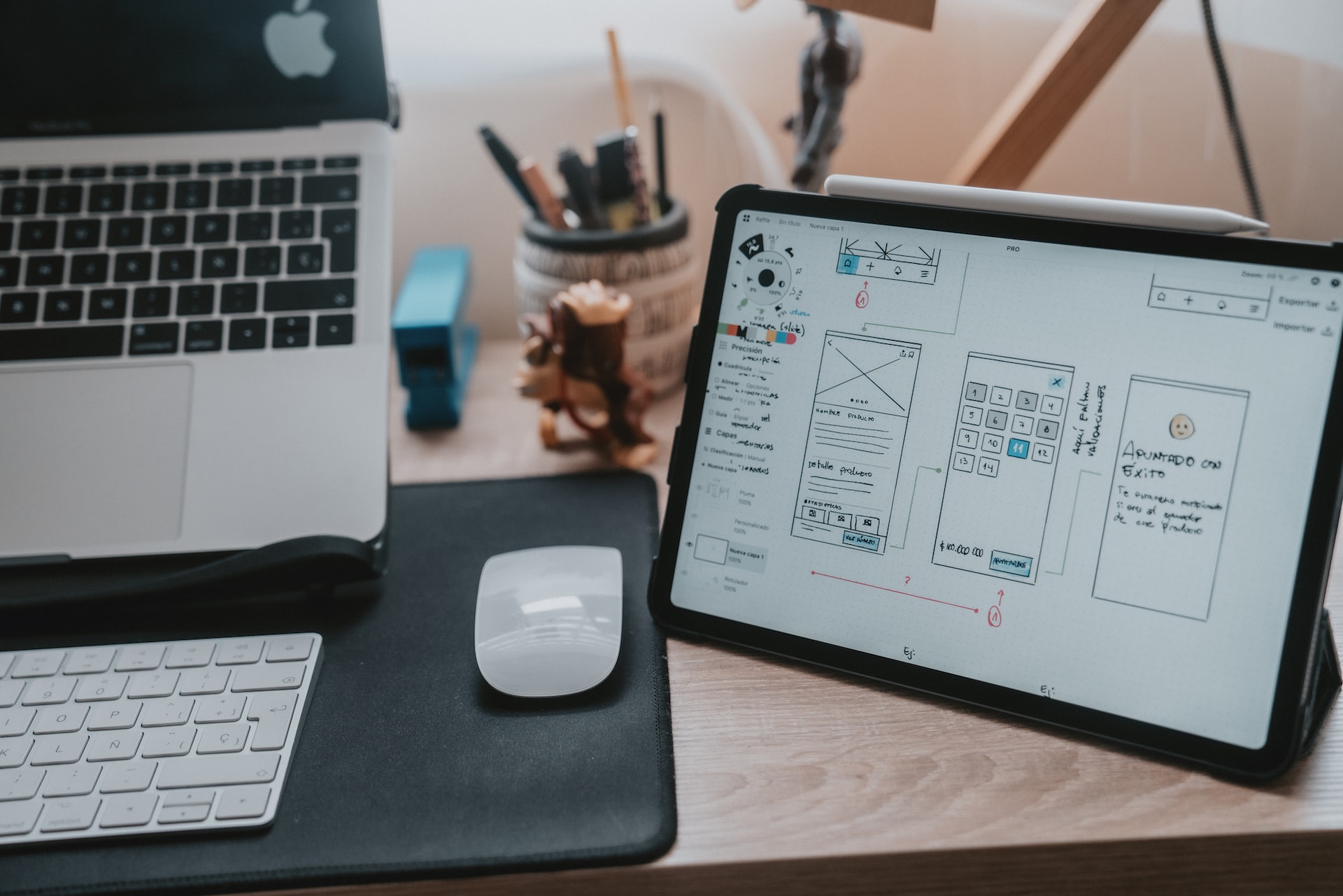
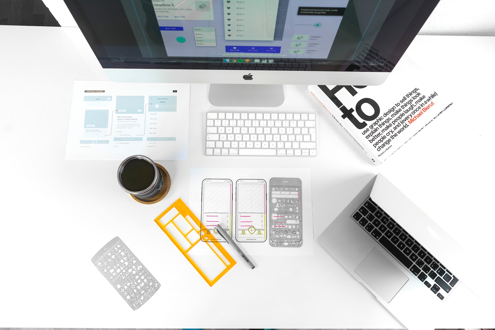
Material Design is a unified system that bridges user interface (UI) design with purposeful interactivity and responsive behavior. Originally introduced by Google in 2014, Material Design established a set of guidelines and components to bring consistency, clarity, and usability across platforms and devices. But over the years, it has evolved into a mature, flexible framework that now empowers designers to create customized visual experiences while still benefiting from foundational principles of coherence, structure, and interaction.
Let’s dive deeper in to Material Design not only as a design system but as a method for crafting digital experiences rooted in motion, hierarchy, and physical metaphors.
A Brief Origin of Material Design
Material Design was launched to address fragmentation in Android user interfaces. With countless OEMs designing their own skins and inconsistent app behaviors across devices, Google needed a coherent system that could bring unity. But it went beyond Android. Material Design was conceived to offer a visual language that synthesizes classic principles of good design with the innovation and possibility of technology and science.
It drew inspiration from the physical world—light, surfaces, depth, and materiality—giving digital interfaces a sense of tactility. Elevation, shadows, and layering weren’t just stylistic decisions; they were functional signifiers that guided users and clarified interactions.
Core Principles of Material Design
At its heart, Material Design is built on a few foundational principles:
1. Material is the metaphor
The design system is based on a tangible environment inspired by paper and ink, but it expands the capabilities of traditional surfaces with digital affordances. Shadows, edges, and realistic animation simulate depth and physical relationships—helping users intuitively understand interface hierarchies.
2. Bold, graphic, intentional
Typography, space, color, and imagery are used deliberately. Interfaces using Material Design leverage dramatic color choices, structured grids, and strong focal points to create rhythm and emphasis. These aren’t decorative choices—they’re functional decisions that drive usability.
3. Motion provides meaning
Animation is not there to decorate. Motion in Material Design serves to maintain continuity, orient the user, and reinforce user actions. Elements move in a way that respects physics, mimicking mass and acceleration, making transitions more understandable.
Structure and Components: Anatomy of the System
Material Design provides an extensive set of components, patterns, and guidelines for developers and designers. These components are designed to be adaptive, accessible, and consistent.
Grid and Layout
The grid system ensures content is aligned and scalable across screen sizes. It provides predictable placement and rhythm that reinforces comprehension.
-
Responsive layout grid: Defines columns, gutters, and margins
-
Breakpoint system: Enables seamless behavior across screen sizes
-
Padding and keylines: Create visual balance and alignment
Typography
Material Design utilizes a typographic scale that aligns with modular design principles. It supports clarity, legibility, and brand expression through custom type pairings and hierarchies.
-
Roboto and Noto were the original typefaces, but Material 3 enables full typographic customization
-
Emphasis on line-height, letter-spacing, and visual hierarchy
Color System
Material Design uses dynamic color schemes built on primary and secondary palettes. Material You (Material 3) introduced color extraction from user wallpapers, making UI elements more personalized and adaptive.
-
Tonal palettes: 13 color roles derived from a single source color
-
Contrast rules: Ensure accessibility for foreground/background combinations
-
Theming tools: Let designers customize colors to reflect brand identity
Elevation and Shadows
One of Material Design’s distinctive features is its elevation model. Each UI component exists on a z-axis, helping define relationships and interaction levels.
-
Cards, menus, and dialogs: Use elevation to convey hierarchy
-
Shadows and overlays: Provide depth and context to movement and focus
Components
A wide range of UI elements come pre-defined:
-
Buttons (text, elevated, outlined, filled)
-
Navigation (tabs, drawers, bottom nav)
-
Lists, chips, sliders, snackbars, dialogs, and more
Each component has clear behavior and interaction states that align with accessibility standards and interaction feedback best practices.
Evolution: From Material Design to Material You
While the original system introduced uniformity, the newer Material You (Material 3) initiative ushered in personalization, flexibility, and accessibility as core values. Google recognized that rigid consistency wasn’t enough—interfaces needed to feel personal, adaptable, and expressive.
What Changed in Material You?
-
Dynamic Color
Material You introduced dynamic theming where the system extracts color schemes from the user’s wallpaper or image, allowing for deeply personalized but still harmonized UI environments.
-
Emphasis on Accessibility
Automatic contrast validation, font scaling, and adaptable UI layouts made it easier for apps to conform to WCAG guidelines.
-
Updated Components
Components are more modular and flexible, supporting newer interaction paradigms such as touch, stylus, and voice.
-
Design Tokens and Tooling
Material You offers better design tokens and integration with tools like Figma and Android Studio, allowing for efficient design-dev handoffs and customizations.
Material Design in Practice
While originally seen as a Google-centric system, Material Design has expanded far beyond Android or Google apps. Designers and developers use it as a launchpad—not a constraint—for building modern, usable interfaces.
When to Use Material Design
-
Android app development: Native components and behavior are optimized for Material.
-
Cross-platform consistency: Brands that span mobile and web can create coherence.
-
Faster MVPs: Prebuilt components and guidelines speed up prototyping.
-
Accessible design: Material provides out-of-the-box accessibility support.
-
Developer-friendly handoff: Clear documentation and tooling streamline development.
When to Customize or Extend
Material Design encourages customization through branding layers, component modification, and theming tools. Many designers use Material as a base, but evolve it through typography, color, animation, and micro-interaction tailoring.
Examples include:
-
Redefining the color tokens to reflect a brand’s identity
-
Modifying elevation levels to create a flatter visual style
-
Swapping typography for a more expressive or editorial tone
Benefits of Using Material Design
-
Clarity and Usability
Material Design’s visual language supports intuitive interaction through cues like shadow, layering, and motion.
-
Consistency
A shared system allows teams across disciplines to build experiences that feel unified, even when built by different contributors.
-
Speed and Scalability
Predefined components accelerate the design process, allowing focus to shift from mechanics to experience.
-
Accessibility
Out-of-the-box support for WCAG guidelines, contrast ratios, font scaling, and screen reader support makes Material Design a solid foundation for inclusive design.
-
Customization Without Chaos
While it brings structure, Material Design is not restrictive. It offers enough flexibility to allow distinct brand personalities to shine through.
Criticism and Challenges
No system is without its challenges, and Material Design has faced its share of critiques:
-
Uniformity vs. Originality
Early implementations led to a wave of apps that looked too similar, diluting brand distinction.
-
Overuse of Motion
Some designers implemented transitions and animations that felt excessive or distracting, which countered the principle of motion enhancing usability.
-
Web Implementation Gaps
Material’s web component libraries lagged behind native implementations at times, resulting in uneven performance.
-
Heavy Design Language
When misapplied, Material can feel overly ornamental or rigid—especially for minimal or utilitarian digital products.
To counter these issues, Material You introduced more adaptability, putting personalization and context back into the designer’s hands.
Material Design and the Future of Design Systems
Material Design laid the groundwork for other systems like Fluent by Microsoft and Apple’s Human Interface Guidelines to modernize. Its contribution to the democratization of design systems cannot be understated.
What makes Material Design particularly enduring is its balance: it simplifies the design process without stripping away the ability to innovate. It educates and empowers both novice designers and experienced teams to create functional, accessible, and beautiful experiences.
As interfaces become more adaptive—spanning foldables, voice UIs, AR, and AI—the principles behind Material Design continue to guide thoughtful decision-making, even beyond the strict application of its rules.
Final Thoughts
Material Design is not just a set of rules or components—it’s a conversation between users, technology, and visual language. Its evolution shows how design systems must be living documents, responsive to how people use digital environments.
Whether used as a base system or deeply customized framework, Material Design continues to offer designers a rich vocabulary for digital storytelling, interaction, and inclusivity. Its contribution is both foundational and forward-looking—providing clarity in a digital world that often overwhelms.
Our published articles are dedicated to the design and the language of design. VERSIONS®, focuses on elaborating and consolidating information about design as a discipline in various forms. With historical theories, modern tools and available data — we study, analyze, examine and iterate on visual communication language, with a goal to document and contribute to industry advancements and individual innovation. With the available information, you can conclude practical sequences of action that may inspire you to practice design disciplines in current digital and print ecosystems with version-focused methodologies that promote iterative innovations.