Table of Contents
The Role of Imagery and Presentation
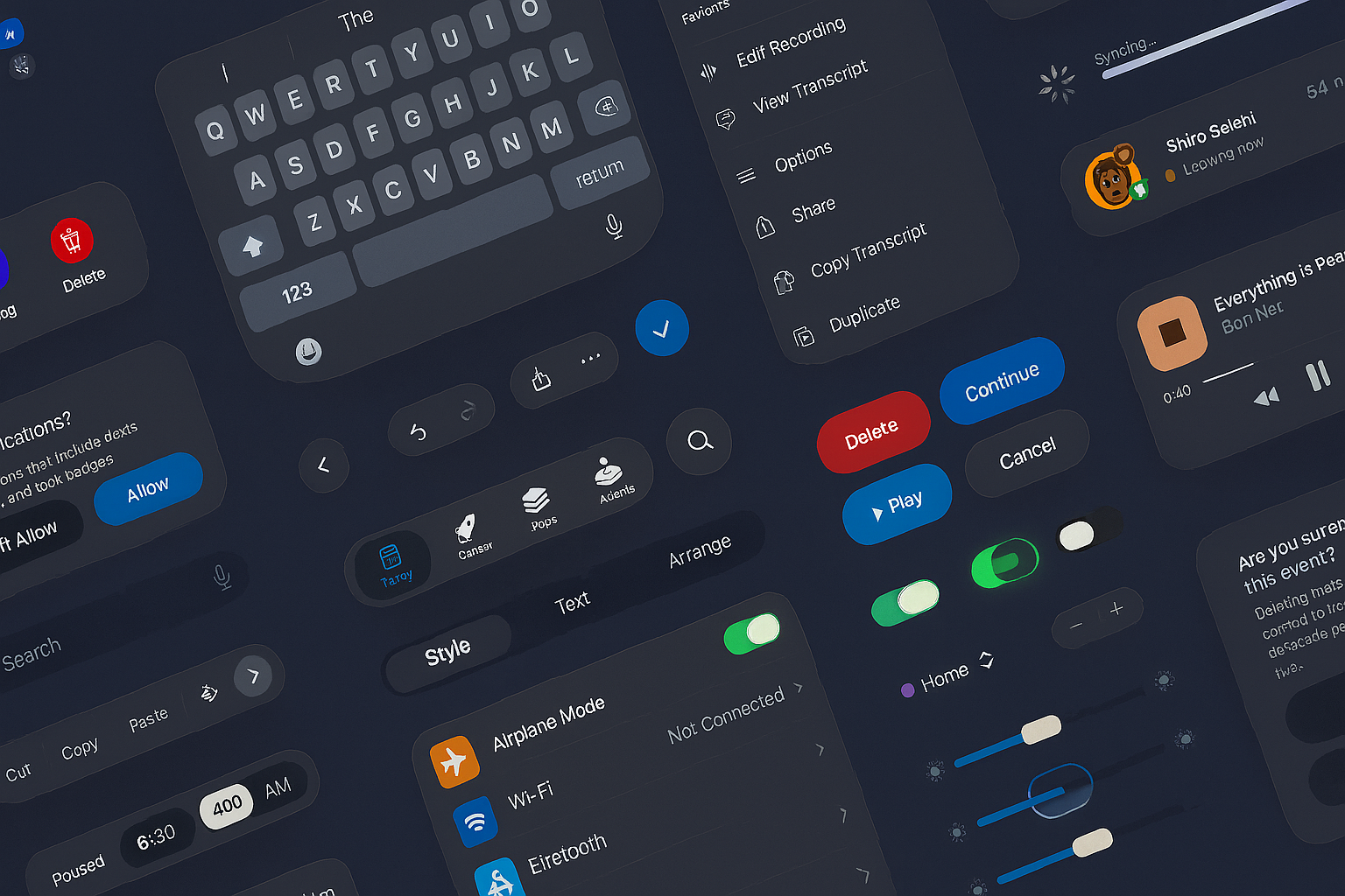
Design is a language we see before we read. Long before text or interface, images conveyed meaning—instinctive, fast, and universal. In today’s digital environments, how things look isn’t just a matter of taste—it’s a matter of function, clarity, and connection. Every shape, tone, and layout decision contributes to how users feel, interpret, and respond.
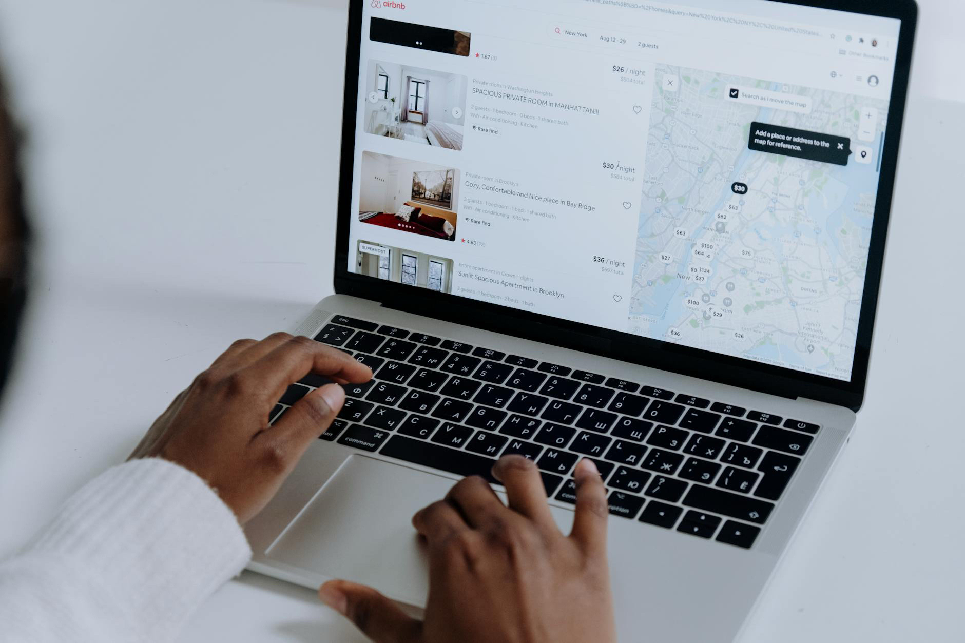
The way something is presented affects how it’s perceived. Good design directs attention, builds trust, and enhances comprehension. Whether on a website, app, or printed piece, the arrangement of content guides users and signals purpose.
In digital experiences, aesthetic choices aren’t just for show:
-
They shape interactions. Layout, structure, and composition tell users what matters most.
-
They strengthen identity. Elements like color, typography, and iconography build cohesion across touchpoints.
-
They improve readability. Grouping, spacing, and emphasis help organize complex information.
-
They support inclusion. Strong contrast, clean structure, and intentional feedback loops make content accessible.
Visual Thinking as a Design Method
Designers think in shapes, patterns, and space. Translating abstract ideas into tangible form is what allows creative teams to simplify complexity and make systems usable. This isn’t art for art’s sake—it’s logic made legible.
What sets effective design apart is intention:
-
Use of white space and alignment to create balance
-
Patterns that create rhythm and flow
-
Systems that scale across devices
-
Details that create delight without distraction
This approach allows form to follow function, but also to carry meaning.
Creating Consistent Language Through Design
Consistency is the foundation of recognition. Over time, repetition of visual cues creates familiarity and trust. This includes:
-
Logo and identity rules
-
Use of color and contrast across contexts
-
Responsive typography systems
-
Icon families and graphic marks
-
Grid logic and spacing systems
-
Transitions and motion behaviors
Design systems make these choices repeatable without being rigid. Flexibility within a defined structure allows for creativity that stays on brand.
Design as Strategic Communication
Design isn’t decoration—it’s an essential layer of communication. Well-executed work impacts:
-
Information clarity: Content becomes easier to understand through thoughtful composition.
-
User engagement: Clean, appealing environments invite exploration and reduce friction.
-
Conversions: Trust, usability, and delight all influence action.
-
Accessibility: A clear structure and mindful contrast support users of all abilities.
The value of strong presentation is measurable—and foundational.
Evolving Standards
Trends come and go, but legibility, clarity, and structure remain timeless. New environments—like immersive AR, dark mode, or generative tools—push the boundaries of how we create, but the principles remain: clarity over clutter, intention over excess, and user needs above all.
Design continues to evolve, but its purpose stays steady—to bring information to life, make meaning visible, and connect people through form.
Our published articles are dedicated to the design and the language of design. VERSIONS®, focuses on elaborating and consolidating information about design as a discipline in various forms. With historical theories, modern tools and available data — we study, analyze, examine and iterate on visual communication language, with a goal to document and contribute to industry advancements and individual innovation. With the available information, you can conclude practical sequences of action that may inspire you to practice design disciplines in current digital and print ecosystems with version-focused methodologies that promote iterative innovations.
Related Articles –
-

Design Is Not Art, Art Is Not Design
-

Why Great Products Still Fail: The Overlooked Roles of Acceptability and Adaptability
-
Apple’s New UI Kits for iOS and iPadOS 26: Designing the Future Interface
-
Liquid Glass UI: A New Transparency in Interface Design
-

Using WAVE and Lighthouse Together for Better Accessibility Testing
-
Speeds Up Design Decisions with Grid Systems
-

Beyond Aesthetics: 5 Pillars of Effective Web Design Today
-

User Experience Improvements: A Human-Centered Approach
-

The Evolution of Skeuomorphism: Claymorphism, Neumorphism, and the Return of Tactile Interfaces
-

When Visual UI/UX Is Not Enough