Table of Contents
Implementing Visual Branding Across Every Touchpoint
Once a visual brand is developed, the real work begins: applying it across every interaction a person has with the brand. This is where visual branding moves from theory to practice. It’s not just about having a great logo or a color palette—it’s about how that identity performs in the wild.
From System to Experience
Whether it’s a homepage, a shipping box, a digital product interface, or a recruitment ad, every brand experience needs to feel coherent. The goal isn’t sameness—it’s recognition. That means the brand must be flexible enough to show up in different ways, while still feeling unified and unmistakably “you.”
Visual Consistency Builds Trust
Visual consistency isn’t about duplication—it’s about maintaining a recognizable rhythm. Think of it as setting a visual tone that remains steady, even when the content or context changes. Fonts, buttons, grid systems, photography treatments, icon styles—all of these create structure and familiarity. And that familiarity, over time, becomes trust.
Without consistency, brands feel fragmented. Users question credibility when experiences shift dramatically from one channel to another. A cohesive visual brand provides the connective tissue that binds everything together, even when teams or vendors change.
Digital First, But Not Digital Only
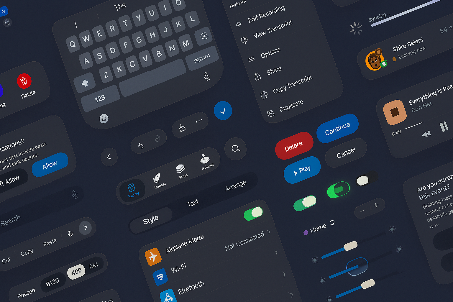
Most brands today are experienced first through screens. That means digital design—websites, apps, dashboards, social media—often leads the visual expression. Responsive grids, interaction patterns, and scalable vector assets become foundational.
But strong visual brands also extend beyond the screen. Environments, printed materials, product packaging, signage, and merchandise still play a role in shaping perception. For example, the way a brand looks in motion—on video, in presentation decks, or in micro-animations—carries weight. Typography needs to perform just as well on paper as it does in an app. Color contrast needs to remain accessible under various lighting conditions.
Visual branding must be media-agnostic by design, enabling consistency whether someone is encountering the brand at a trade show booth or in a mobile push notification.
Brand Governance That Enables, Not Restricts
For visual branding to be scalable, it needs strong governance. But governance doesn’t mean locking creativity in a box. It means providing enough structure that teams can work independently while still staying on-brand.
This is where design systems and brand guidelines come into play. They allow cross-functional teams—marketing, product, sales, and HR—to create within boundaries. These tools often include libraries of approved assets, color and type hierarchies, usage dos and don’ts, component design templates, and interaction behaviors.
But the most effective systems also allow for experimentation. Great visual branding evolves with the brand’s needs. When guidelines are treated as starting points, not static rules, they empower better outcomes—enabling innovation without sacrificing integrity.
Adapting the Brand as You Grow
A visual brand isn’t static. As a company grows, pivots, or refines its mission, its visual identity often needs to evolve too. That doesn’t mean discarding everything and starting over. Often, it means adjusting the visual tone to reflect a new maturity or audience shift.
Maybe the typography becomes more editorial. Maybe the color palette expands to accommodate a wider digital presence. Maybe motion principles become more refined to reflect an evolved user experience. These changes should still retain core brand DNA—familiar enough to feel like a continuation, but evolved enough to reflect progress.
In a global or multi-product brand, this also means creating space for sub-brands and extensions. A good system scales—allowing each business unit or offering to have its own personality without breaking the system.
Bridging Teams With Visual Language
One of the most overlooked benefits of strong visual branding is internal alignment. When visual language is clear and codified, it becomes a common language across departments. Designers, developers, marketers, and executives can talk about design decisions with clarity and confidence.
This shared language speeds up execution and strengthens collaboration. It removes ambiguity from everyday tasks—whether building a landing page, designing a banner, or updating internal documents.
When teams are aligned visually, they move faster, waste less time in revision loops, and create better, more consistent user experiences.
Every Touchpoint Tells a Story
Visual branding isn’t limited to big moments like product launches or ad campaigns. It lives in small details: the favicon on a browser tab, the color of a hyperlink, the hover animation on a button, the tone of a footer navigation. These micro-moments shape how people feel about a brand. Over time, they accumulate into a full picture.
When every touchpoint aligns with the brand’s visual identity, it sends a powerful signal: This brand knows who it is—and it shows up with intention.
Our published articles are dedicated to the design and the language of design. VERSIONS®, focuses on elaborating and consolidating information about design as a discipline in various forms. With historical theories, modern tools and available data — we study, analyze, examine and iterate on visual communication language, with a goal to document and contribute to industry advancements and individual innovation. With the available information, you can conclude practical sequences of action that may inspire you to practice design disciplines in current digital and print ecosystems with version-focused methodologies that promote iterative innovations.
Related Articles –
-

What Is Design Language? Definition and Purpose
-

Why Great Products Still Fail: The Overlooked Roles of Acceptability and Adaptability
-
Apple’s New UI Kits for iOS and iPadOS 26: Designing the Future Interface
-

Liquid Glass UI: A New Transparency in Interface Design
-

UI Design for a Modern Website
-

The Evolution of Skeuomorphism: Claymorphism, Neumorphism, and the Return of Tactile Interfaces
-
Authentic Brand Experiences Through Web Design
-

Usability Testing: Where Aesthetics Meet Functionality
-

Enhancing Visual Appeal and Usability for Optimal Performance
-

Branding and UX Design for Exceptional User Experiences