Table of Contents
Building Better User Experiences Through Typography
Fonts shape the visual language of digital interfaces. Far more than aesthetic decoration, typography influences perception, usability, trust, and emotional engagement. In user experience (UX) design, typeface selection is one of the most critical yet underestimated decisions. It determines how users read, feel, and act on information.
The science behind type choice, legibility, and psychological impact reveals a deep connection between typefaces and human cognition. Every font carries a tone. Every letterform makes a decision. And when typography aligns with accessibility and intention, it becomes a silent enabler of clarity and trust.
Why Fonts Matter in UX and Interface Design
In digital product design, type choices affect both usability and emotion. According to a study published in Cognition, users draw subconscious conclusions about a message’s credibility based on the typeface used. Fonts contribute to a user’s perception of professionalism, friendliness, modernity, or tradition—all before reading a word.
Poor typography creates friction. Tight spacing, low contrast, or illegible typefaces increase cognitive load. The result? Higher bounce rates, lower comprehension, and diminished trust. On the other hand, optimized fontface choices improve retention, scannability, and the emotional resonance of a digital experience.
Fonts Influence:
-
Readability: How easily users can read long passages of text.
-
Legibility: How clearly each individual character is distinguished.
-
Brand Voice: How typography communicates tone—whether playful, authoritative, minimalist, or expressive.
-
Accessibility: How users with visual impairments or dyslexia can access and interpret information.
-
Hierarchy and Flow: How font weights and styles guide the eye and structure content.
Typography isn’t just form—it’s function with feeling.
Typeface Anatomy: The Building Blocks of Fonts
Understanding the anatomy of typefaces allows designers to choose fonts with precision. Each typeface consists of intricate parts that influence how we perceive characters and words.
Key Typographic Terms:
-
Baseline: The invisible line on which most letters sit.
-
X-height: The height of lowercase letters (like x, a, e) without ascenders or descenders. A higher x-height increases legibility, especially at small sizes.
-
Ascender/Descender: Ascenders are parts of letters that extend above the x-height (like in b or h), while descenders dip below the baseline (like in g or p).
-
Serifs: Small strokes at the ends of characters. Serif typeface often aid readability in print, while sans-serif fonts dominate digital interfaces.
-
Stroke Contrast: The variation in thickness of letter strokes. Fonts with high contrast can appear elegant but may hinder legibility at small sizes.
By evaluating these attributes, designers can better align typefaces with functional and emotional goals.
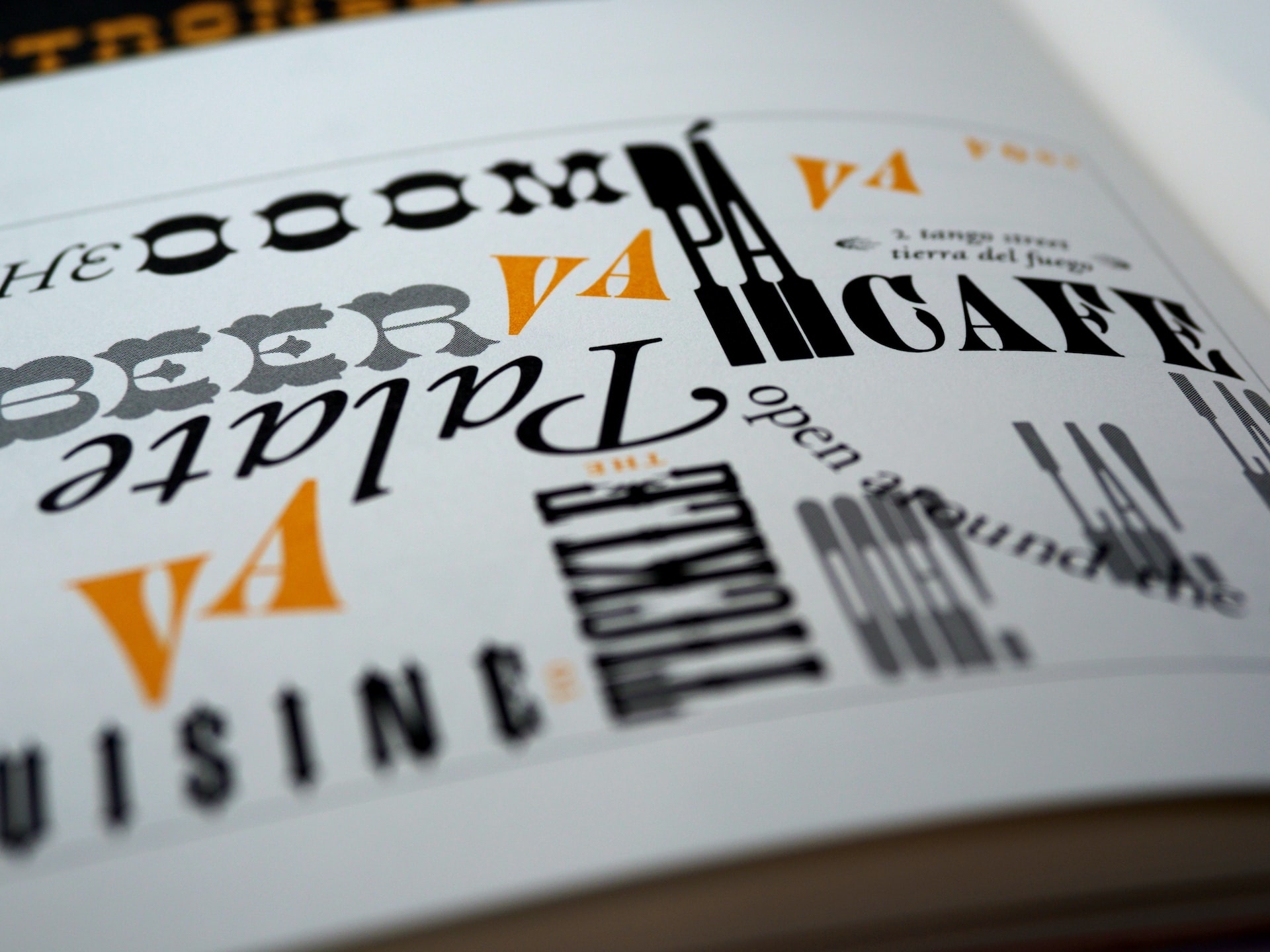
Serif vs. Sans-Serif: A Usability Perspective
One of the most debated aspects of typography is the serif vs. sans-serif divide. Serif fonts, such as Georgia or Times New Roman, feature decorative extensions on characters. Sans-serif fonts like Helvetica or Roboto lack these strokes, offering a cleaner appearance.
In Practice:
-
Serif fonts: Ideal for long-form reading, often used in editorial content or PDF reports. They guide the eye horizontally and help distinguish individual letters.
-
Sans-serif fonts: Better suited for interfaces and digital environments where clarity at small sizes is essential.
Research from MIT’s AgeLab found that participants read on-screen text faster when presented in sans-serif typeface. However, the preference between serif and sans-serif often depends on context, screen size, and user expectation.
The Science of Legibility
Legibility is about how quickly and accurately the eye can recognize characters and words. It’s a mechanical function of how well-designed and spaced type is. Numerous studies confirm that typographic decisions directly affect reading speed, comprehension, and even emotional response.
Considerations That Improve Legibility:
-
Sufficient spacing: Both letter spacing (kerning) and line height (leading) should support natural reading rhythm.
-
Contrast: Black text on a white background remains the gold standard for most users.
-
Font weight: Regular or medium weights offer the best readability. Thin and ultra-light fonts often fail accessibility tests, especially for users with low vision.
-
Clear characters: Avoid typefaces where certain letters are easily confused, such as a lowercase “l” vs. a capital “I.”
Google Fonts recommends a minimum type size of 14px for body text on mobile and desktop interfaces. This aligns with WCAG 2.2 accessibility guidelines.
Typography and Emotional Resonance
Fonts don’t just function; they communicate. The emotional tone of a typeface affects how users feel when they engage with a brand or interface. A playful rounded font like Comic Neue sends a different message than a sharp, geometric sans-serif like Futura.
According to a study in the Journal of Consumer Psychology, users associate fonts with personality traits. Serif fonts suggest tradition, reliability, and authority. Sans-serif fonts imply modernity, cleanliness, and efficiency. Script fonts can be elegant or informal depending on context.
In UX design, the emotional resonance of a font should match the product or brand voice. A fintech platform demands clarity and trust. A fashion brand might prioritize sophistication and style. Consistency across typographic choices builds a cohesive experience.
Accessibility and Inclusive Typography
Inclusive typography is critical to creating experiences that everyone can use. Accessible fonts reduce barriers for users with vision impairments, dyslexia, or cognitive disabilities.
Key Accessibility Practices:
-
Use accessible typefaces: Fonts like Atkinson Hyperlegible or Lexend were specifically designed to support visual clarity.
-
Avoid decorative fonts in UI elements: Use highly legible fonts for buttons, menus, and inputs. Decorative or script fonts should only appear in large display contexts.
-
Use true text—not images of text: Screen readers cannot interpret rasterized text.
-
Maintain strong color contrast: According to WCAG 2.2, normal text should have at least a 4.5:1 contrast ratio against its background.
Accessibility is not a constraint—it’s a design opportunity. Fonts that work for more people often perform better for everyone.
Variable Fonts and Performance Optimization
The rise of variable fonts allows designers to combine multiple font weights, styles, and widths in a single file. This improves design flexibility and web performance.
Instead of loading separate font files for bold, italic, and light weights, a single variable font file can adapt dynamically. This reduces page load times and bandwidth usage while offering greater control over micro-typographic adjustments.
Modern UI systems like Google’s Material Design and Apple’s Human Interface Guidelines now recommend using variable fonts for both flexibility and technical efficiency.
Fonts and UI Hierarchy
Clear visual hierarchy helps users navigate content effortlessly. Typography—through size, weight, and spacing—establishes that hierarchy.
Techniques to Define Hierarchy:
-
Use size progression: Headings should be noticeably larger than body text. Subheadings should clearly separate sections.
-
Font pairing: Combine complementary typefaces—a display font for headlines and a readable sans-serif for body copy.
-
Weight variation: Use bold strategically for emphasis, not everywhere.
-
Whitespace: Let type breathe. Generous margins and padding around text elements improve clarity and reduce fatigue.
Each typographic decision either amplifies or dilutes the structure of a page. Strong hierarchy ensures that users always know where they are, what matters, and what to do next.
Cultural and Contextual Considerations
Font interpretation varies by culture. In some languages, serif forms may appear dated, while in others they are associated with formality and heritage. Latin-based fonts differ significantly from Arabic, Chinese, or Cyrillic systems, which require different considerations for line weight, curvature, and spacing.
When designing for a global audience, it’s essential to:
-
Test multilingual typography with native readers.
-
Avoid fonts that fail to support non-Latin characters.
-
Preserve consistency in type tone across localizations.
Global UX requires global typographic empathy.
Choosing the Right Fonts: A Strategic Process
Font selection should be intentional, not impulsive. Designers should consider technical constraints, brand voice, accessibility requirements, and performance metrics.
Step-by-Step Approach:
-
Define tone: What feeling should the font convey—friendly, serious, modern, minimalist?
-
Test for legibility: Review on multiple devices and screen sizes.
-
Check licensing: Ensure the typeface is legally usable in the project context.
-
Test with users: Conduct usability tests to observe reading behavior and preference.
-
Pair carefully: Ensure fonts work together, not against each other.
-
Audit accessibility: Run WCAG tests for contrast, size, and clarity.
Typography is design’s quiet engine. It guides, informs, and persuades without ever drawing attention to itself—when done right.
Final Thoughts
Fonts are not simply design choices—they are UX decisions that influence how people absorb, trust, and act on information. Great typography speaks clearly, feels natural, and removes obstacles between a user and their goal. It builds emotional bridges while maintaining structural integrity.
In a landscape of infinite typefaces and visual noise, the challenge is not to choose the most stylish font—but the most suitable one. Through careful attention to anatomy, hierarchy, accessibility, and emotional tone, designers can elevate every experience through type.
When typography is aligned with purpose, it doesn’t just communicate—it empowers.
Our published articles are dedicated to the design and the language of design. VERSIONS®, focuses on elaborating and consolidating information about design as a discipline in various forms. With historical theories, modern tools and available data — we study, analyze, examine and iterate on visual communication language, with a goal to document and contribute to industry advancements and individual innovation. With the available information, you can conclude practical sequences of action that may inspire you to practice design disciplines in current digital and print ecosystems with version-focused methodologies that promote iterative innovations.