Table of Contents
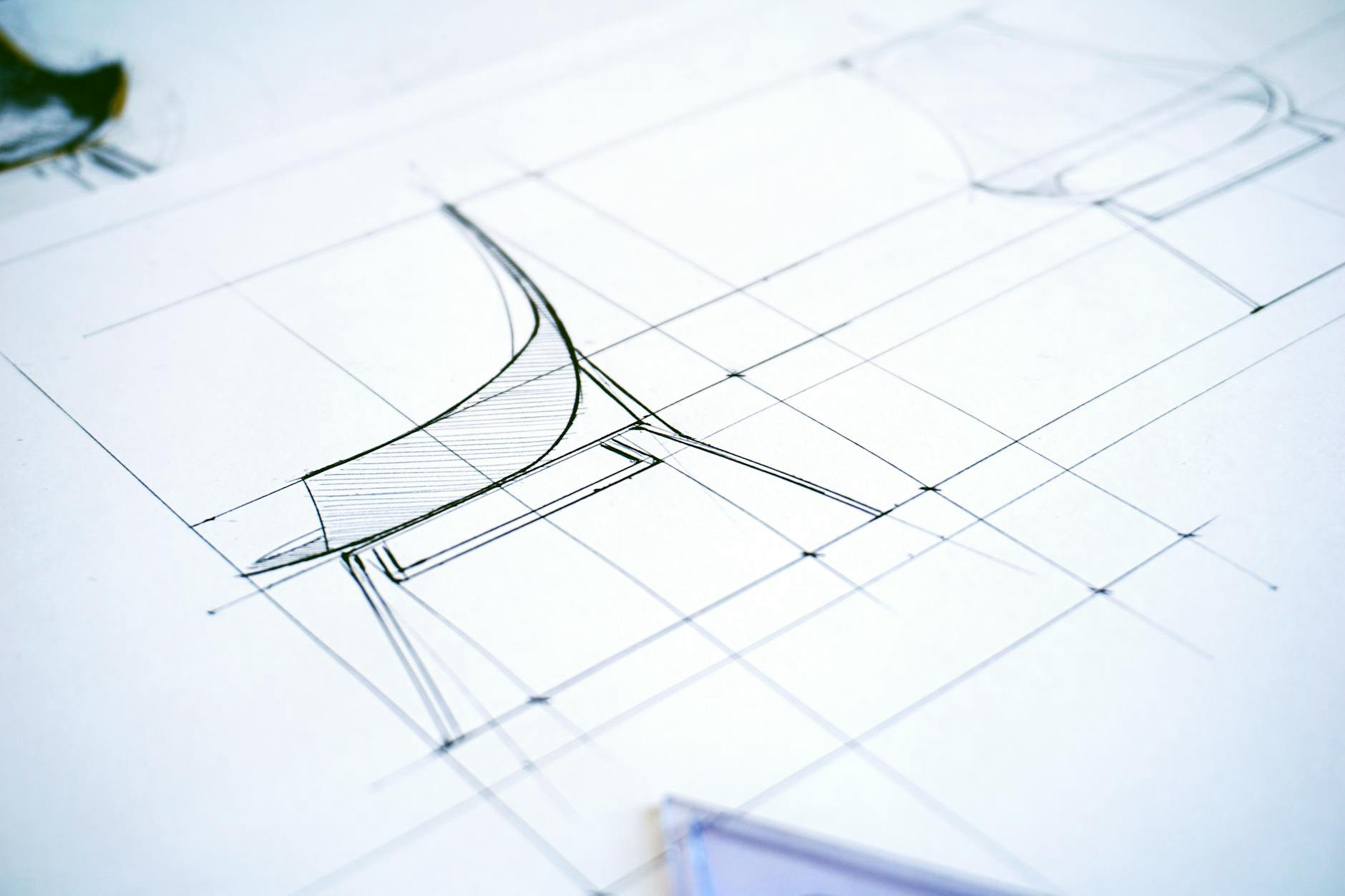
Modern UI: Form, Function, and Feel
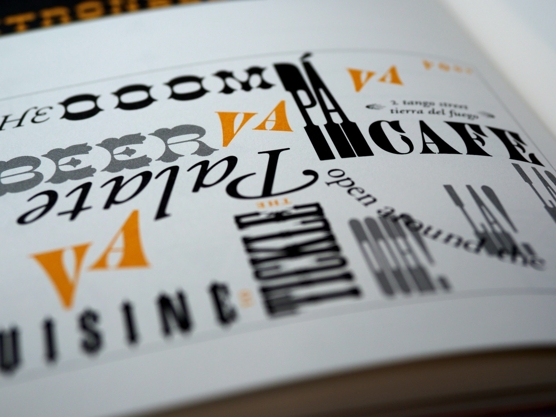
Typography is a backbone of graphic design and visual communication. In a digital landscape where users scan more than they read, typography sets the tone, guides the eye, and defines hierarchy. It’s where form meets function, and where aesthetic decisions shape how users feel and what they understand.
More Than Aesthetic: Typography as Function
In user interface design, typography does heavy lifting. It organizes content, conveys purpose, and establishes structure without adding extra visual noise. A bold heading signals priority. A lighter subtext whispers supplementary details. The right spacing, sizing, and contrast reduce cognitive load, helping users navigate intuitively.
Modern UI relies on typography to:
-
Create visual hierarchy without relying on excess color or graphic elements
-
Improve readability and scanability across devices and screen sizes
-
Establish brand consistency through tone and style
-
Support accessibility by using legible typefaces and proper contrast ratios
A UI without considered typography often feels flat or disjointed, no matter how functional the layout or interactive elements.
Typography and User Emotion
Every typeface carries personality. A geometric sans-serif like Futura feels modern and minimal; a humanist serif like Georgia feels trustworthy and editorial. These characteristics influence how users perceive a product—whether it feels playful or serious, premium or utilitarian.
Typography reinforces brand identity in subtle but powerful ways. The font choices across a UI often work behind the scenes to create emotional resonance, which increases engagement and trust. Clean, legible typography feels safe. Messy, inconsistent typography creates friction—even if users can’t articulate why.
Responsive Type Systems
As interfaces stretch from mobile to desktop and beyond, typography must adapt fluidly. Responsive type systems ensure that legibility and structure are preserved regardless of screen size. This includes:
-
Fluid scaling: Type that adjusts proportionally with the viewport
-
Modular scales: Harmonious font sizes based on a ratio (e.g., 1.25x)
-
Line length and spacing: Optimized for reading comfort on each device
-
Font loading strategies: Ensuring performance doesn’t suffer from visual polish
Modern UI typography also contends with dark mode support, internationalization, and dynamic content—all while maintaining a consistent tone.
Accessibility Begins with Typography
Accessible design isn’t optional—it’s essential. Typography is a foundational layer of accessibility. It helps ensure that content is readable by people with visual impairments, cognitive disabilities, or aging vision. Following best practices like using system fonts, avoiding overly decorative styles, and maintaining adequate contrast between text and background makes interfaces more inclusive.
Good typography:
-
Uses semantic HTML (e.g., real heading tags) for screen readers
-
Maintains a minimum text size and line spacing for readability
-
Supports user zoom and scaling without breaking layout
-
Avoids color alone to convey meaning
By building accessibility into the typographic system, designers don’t just meet compliance—they create experiences that are truly usable for all.
The Hidden Layer of Design Language
Typography isn’t just part of design—it is design. It’s often the most consistent element across platforms and products, making it a key pillar of a unified design language. When teams commit to a defined type system, it simplifies development, aligns branding, and reduces decision fatigue.
Well-documented typography tokens—like font family, size, weight, and spacing—become part of a scalable design system. These tokens enable designers and developers to collaborate with precision and efficiency.
When Type Works, Design Disappears
When typography is thoughtfully executed, users don’t notice it—they just feel the ease of interaction. That’s the sign of great UI. It respects content, enhances usability, and builds identity without shouting. In a world flooded with visual information, typography remains the most powerful—and often underrated—tool in the UI toolkit.
Let it guide, inform, and connect. Because when type works, everything else follows.
Our published articles are dedicated to the design and the language of design. VERSIONS®, focuses on elaborating and consolidating information about design as a discipline in various forms. With historical theories, modern tools and available data — we study, analyze, examine and iterate on visual communication language, with a goal to document and contribute to industry advancements and individual innovation. With the available information, you can conclude practical sequences of action that may inspire you to practice design disciplines in current digital and print ecosystems with version-focused methodologies that promote iterative innovations.
Related Articles –
-

UI Design for a Modern Website
-

The Evolution of Skeuomorphism: Claymorphism, Neumorphism, and the Return of Tactile Interfaces
-

Fundamental Components of Grid Systems
-

How Grids Play a Crucial Role in Interface Design and Achieving Balanced Visuals
-
The Importance of Grids in Design
-

Optimizing Headlines: The First Impression That Shapes Engagement
-

When to Use Skeuomorphic Interfaces: Utility, Context, and User Familiarity
-

Designing Meaning: How UI Elements Create the Narrative of Digital Experience
-

10 Best Design Books Every Creative Should Own
-
Treating Text As An Integral Element of UI Design