Table of Contents
Crafting Interfaces That Connect People and Products
In today’s digital landscape, UI design is often the first—and sometimes only—chance a brand gets to make an impression. Whether it’s a banking app, an e-commerce platform, or a nonprofit website, the interface is where ideas become usable, where actions become possible, and where experience becomes tangible. It’s not just what users see—it’s how they feel while using it.
UI design is about clarity, intention, and human connection. At its best, it doesn’t just make products look good. It makes them make sense.
What Is UI Design?
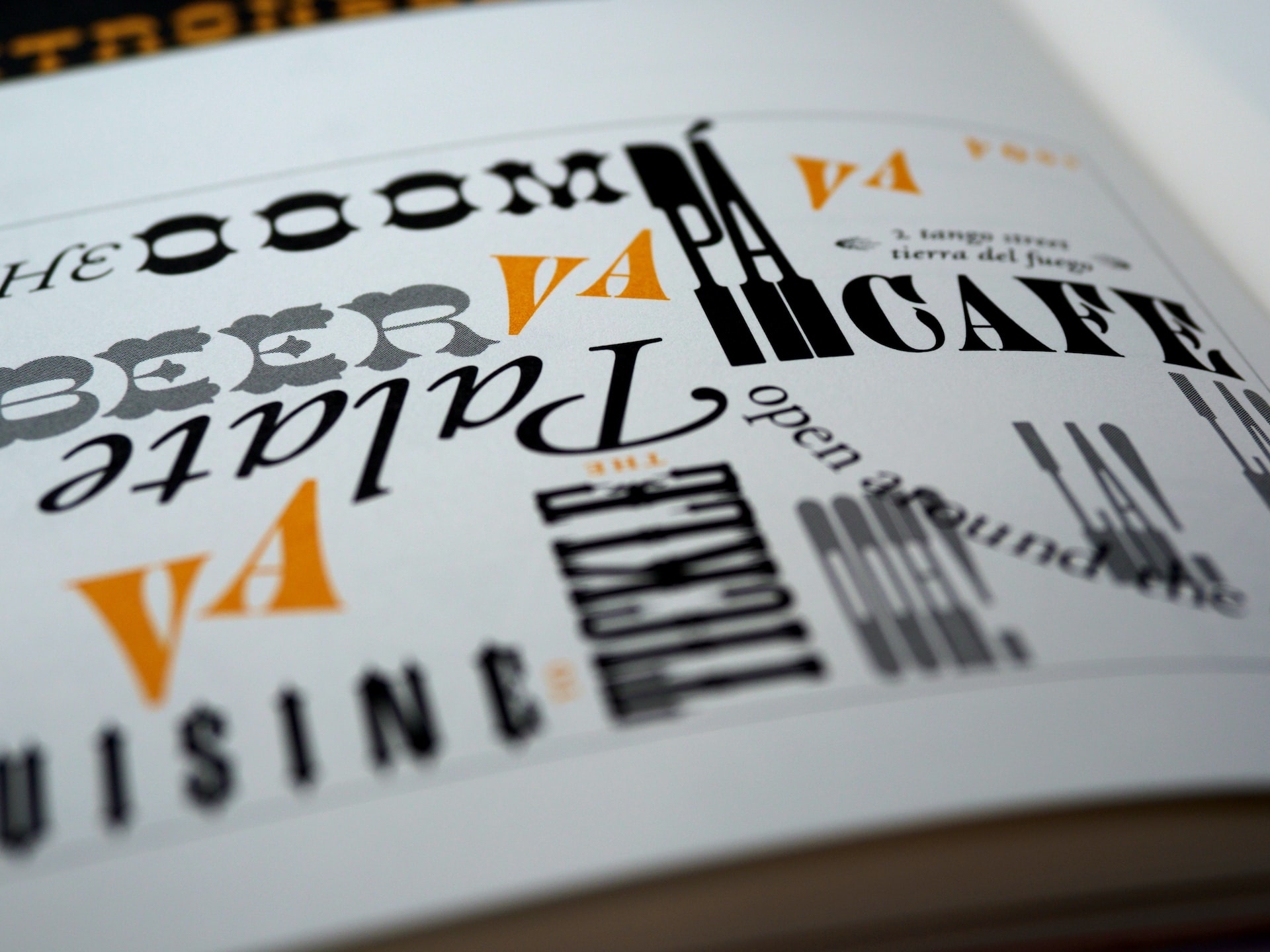
UI design, short for User Interface Design, is the process of creating visually intuitive, interactive elements that enable users to interact with a digital product. This includes everything from navigation menus, buttons, sliders, and form fields to typography, icons, and motion effects.
But UI design isn’t just about arranging components on a screen. It’s about crafting systems of communication between the user and the interface—using visual language to guide actions, signal feedback, and reduce friction.
A well-designed UI allows users to:
-
Understand where they are
-
Know what actions they can take
-
Feel confident in the system’s responsiveness
-
Move smoothly through tasks with minimal confusion
UI design is the handshake between human and machine—and it must feel natural, not forced.
Why UI Design Matters
In an environment where user expectations are higher than ever, UI design plays a crucial role in how products perform in the real world. The interface determines how users perceive value, ease of use, and overall trust.
Strong UI design leads to:
-
Lower bounce rates by eliminating confusion
-
Higher conversions through clearer call-to-actions
-
Greater brand perception by aligning visuals with identity
-
Faster user onboarding through intuitive flows
-
Increased accessibility and inclusivity when done with intention
When users encounter a clean, cohesive interface, they don’t have to think about how to interact—they just do.
Principles of Great UI Design
While every interface is different, the best UI design follows certain principles that improve usability, clarity, and engagement:
1. Consistency
Users rely on patterns. When buttons behave the same way, navigation remains in familiar places, and spacing follows a rhythm, users don’t have to re-learn behaviors on every screen.
2. Hierarchy
Visual hierarchy helps users understand what to do first, second, or not at all. Through size, contrast, color, and proximity, UI designers prioritize content and actions.
3. Feedback
Every action needs a response. From hover states and loading animations to confirmation messages, good UI provides clear feedback that reassures users and keeps them informed.
4. Simplicity
Simplicity doesn’t mean minimal—it means clarity. It’s about reducing unnecessary elements and emphasizing what’s essential. The more straightforward the interface, the easier it is to use.
5. Accessibility
Interfaces should be usable by as many people as possible, regardless of ability. That means sufficient color contrast, scalable text, keyboard navigability, screen reader support, and motion reduction options.
UI Design in Practice: From Concept to Implementation
The UI design process is typically part of a broader product design or UX/UI workflow, and includes stages such as:
1. Wireframing
Before color and polish come into play, UI designers work with skeletal layouts—outlining the structure and functionality of each screen.
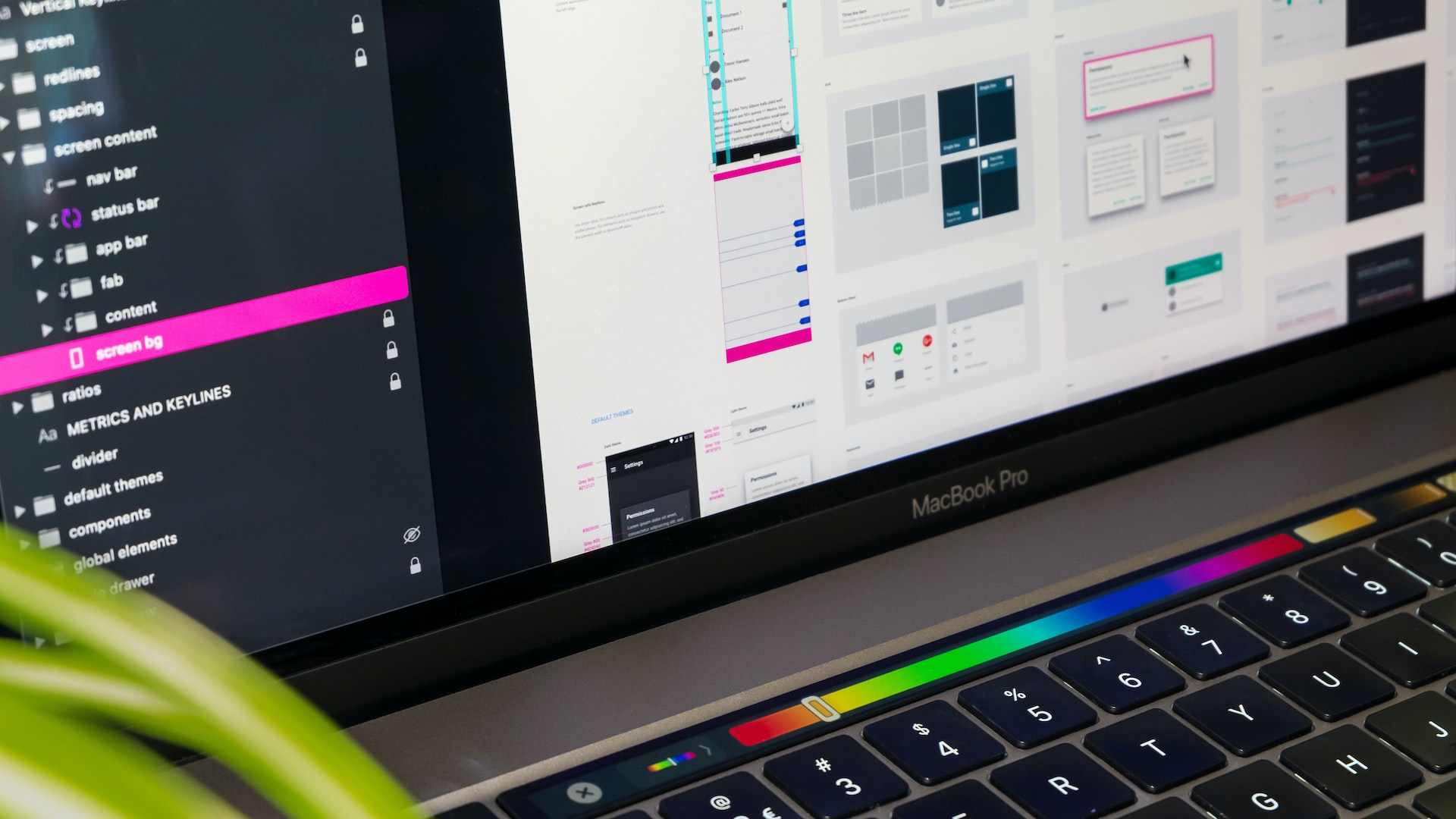
2. High-Fidelity Design
Wireframes are transformed into full visual compositions. Typography, iconography, spacing, color systems, and component states (default, hover, active, disabled) are defined here.
3. Design System
To maintain consistency across large platforms or teams, UI designers build or contribute to design systems—a collection of reusable components, styles, and rules that guide future work.
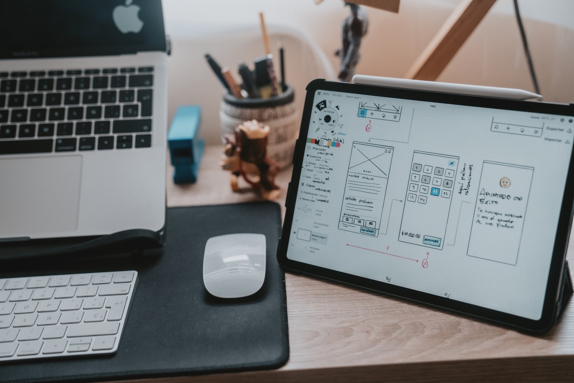
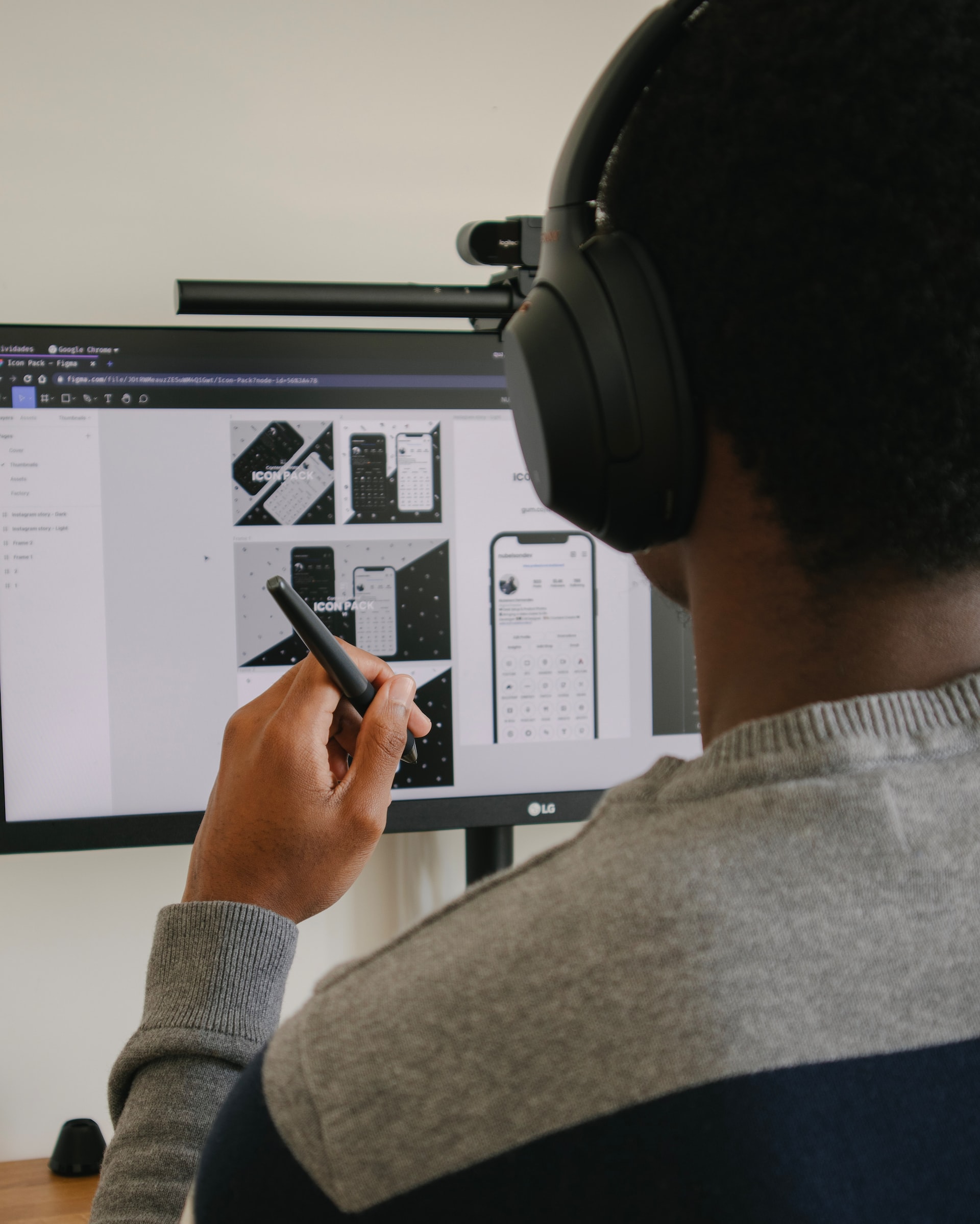
4. Prototyping
Using tools like Figma or Adobe XD, UI designs are brought to life through clickable prototypes. These simulations allow for early testing of navigation, layout, and visual cues before development begins.
5. Developer Handoff
UI design doesn’t end with a finished screen. Designers provide specs, style guides, and documentation to developers, ensuring that the live product matches the visual intention—across devices, browsers, and resolutions.
UI Design and Accessibility
Accessibility is not an optional layer—it’s a core part of responsible UI design. The interface must serve users with varied abilities, including those who rely on:
-
Screen readers
-
Keyboard navigation
-
Voice commands
-
Zoom or text scaling
-
Motion sensitivity settings
Inclusive UI improves the experience for everyone. For example, strong contrast isn’t just helpful for visually impaired users—it enhances clarity in bright daylight. Large tap targets benefit those with mobility impairments, but also make mobile interfaces more forgiving.
UI designers who prioritize accessibility help expand reach, reduce legal risk, and build products that stand the test of time.
UI Design’s Relationship with UX
While UI design focuses on what users see and interact with, User Experience (UX) defines how users feel and navigate through the product as a whole.
This is the most natural and strategic placement since it defines UX directly.
UX provides the strategy, structure, and flow. UI delivers the execution, emotion, and touchpoints.
You can think of UX as the architect, and UI as the interior designer. They need each other:
-
UX defines the path.
-
UI lights the way.
A seamless product experience only happens when both are aligned.
Designing With Intention
UI design is not just about aesthetics—it’s about understanding behavior, creating clarity, and building trust. It’s where design meets communication, where interaction becomes emotion, and where digital tools become human experiences.
Whether you’re designing a landing page, a SaaS dashboard, or a voice-activated interface, UI design is your opportunity to shape perception and performance. When done right, it disappears into the background—letting users focus on their goals, not the tool.
In a world filled with screens and interfaces, great UI design isn’t just appreciated—it’s expected.
Our published articles are dedicated to the design and the language of design. VERSIONS®, focuses on elaborating and consolidating information about design as a discipline in various forms. With historical theories, modern tools and available data — we study, analyze, examine and iterate on visual communication language, with a goal to document and contribute to industry advancements and individual innovation. With the available information, you can conclude practical sequences of action that may inspire you to practice design disciplines in current digital and print ecosystems with version-focused methodologies that promote iterative innovations.
Related Articles –
-

The Pros and Cons of Adaptive Web Design
-
Treating Text As An Integral Element of UI Design
-

The Business Case for Optimized Site Usability
-

The Organized UI: Prioritizing Content Through Visual Hierarchy
-

10 Key UI Design Trends to Implement Now
-

Driven By Feedback: Adaptive Web Design
-
Kicking Off A User Interface Project With Purpose
-
6 Website Button Design Trends To Try Now
-

The Importance of Consistency In UI Design
-
5 Ways to Design a More Intuitive Mobile App