Table of Contents
The Architecture of Visual Communication
Design language is more than a style guide or a toolkit—it is the system through which a brand, product, or interface communicates. It gives structure to creativity and cohesion to complexity. It enables consistency, scalability, and recognition across every digital and physical touchpoint.
As designers, we work across visual, functional, and interactive systems. But without a clear and defined language, those systems fragment. What results is dissonance: inconsistent interfaces, diluted identities, and user confusion. This is where we build a framework—not just of aesthetics, but of logic and intention.
VERSIONS® has been a catalyst of this initiative, creating enablement for every brand to have its own design language. Through research, concept development, and field application, we’ve helped establish design languages that are scalable, modular, and reflective of unique identities.
What Is Design Language?
It’s a visual and interactive system that defines how a product or brand expresses itself. It spans graphic elements (typography, color, iconography), structural patterns (layout, grid systems), and behavioral principles (motion, interaction, affordance).
This language ensures that all pieces—whether a mobile UI, a landing page, or product packaging—feel like part of the same whole. When well-executed, it’s invisible to users but deeply influential in shaping intuitive and cohesive experiences.
Visual Vocabulary and Grammar
Just as language consists of vocabulary and grammar, a design language includes visual elements (vocabulary) and rules for how they interact (grammar). Typography, color palettes, shape systems, spacing logic, and component styling all work together to express personality and function.
In mature systems, design language also includes interaction patterns, motion guidelines, and tone-of-voice documentation—creating a multisensory, multidimensional architecture of expression.
Why Every Brand Needs Its Own
In a world of templates, algorithms, and mass-produced content, design language is what sets a brand apart. It’s the difference between recognition and noise. For brands looking to differentiate meaningfully, a unique and consistent design language is non-negotiable.
Here’s why:
-
Brand Consistency: A coherent design language ensures consistency across all channels—digital, physical, print, packaging, and beyond. This reinforces recognition and builds trust.
-
Efficiency & Scalability: Teams can work faster when design decisions are systematized. Reusable components and patterns save time and prevent reinventing the wheel.
-
User Experience: When design language is rooted in logic and human-centered principles, it creates more intuitive, accessible, and predictable interfaces for users.
-
Cross-Team Alignment: Designers, developers, marketers, and stakeholders speak the same visual language. This alignment is essential for agile workflows and long-term evolution.
Design language turns branding from a set of rules into a living system—fluid enough to adapt, structured enough to scale.
Building a Design Language from Scratch
Creating a design language is a collaborative, iterative process. It requires a balance between creative freedom and system thinking. Here’s how the process typically unfolds:
1. Audit and Discovery
Start by examining what exists. This includes current visual assets, digital interfaces, tone of voice, user behavior, and competitor benchmarks. Look for patterns, inconsistencies, and gaps.
2. Define the Foundation
Establish brand attributes—values, tone, personality—and translate them into visual language. For example, a brand described as “precise and confident” may lean into strong geometric type, high contrast, and minimal motion.
3. Develop Core Elements
Build the primary toolkit:
-
Typography system (heading levels, body styles, responsiveness)
-
Color system (brand colors, neutrals, accessibility contrast)
-
Shape system (rounded vs sharp, borders, containers)
-
Iconography (custom vs system, line weight, detail level)
-
Spacing logic (scale, grid units, breakpoints)
- Patterns (not only visual but experiential)
These should be created modularly, ready for use across different screen sizes and media.
4. Componentization
Translate the core elements into reusable UI components—buttons, cards, modals, nav bars. Use design tools like Figma or Adobe XD to build component libraries.
5. Behavior and Motion
Include rules for interactions and transitions: hover states, page transitions, loading animations, feedback loops. These subtleties shape how users feel when engaging with a brand.
6. Documentation and Governance
Design language must be documented clearly. Not just in static PDFs, but in evolving platforms like design systems or living style guides. Equally important: define who owns the language and how it evolves.
Design Language vs. Design System
Design language is often confused with a design system, but they are not the same.
-
Design Language is the expression—the ‘why’ and ‘what’ behind the system. It defines tone, aesthetics, and behavior at a conceptual level.
-
Design System is the execution—the ‘how’ of implementing the design language. It includes the components, documentation, tokens, and workflows.
In other words: the design language is the soul; the design system is the body. One cannot work without the other.
Evolving Legacy
For companies with long-standing visual identities, the challenge isn’t always building from scratch. It’s modernizing without losing essence. This often involves extracting timeless elements (e.g., a core color, a custom typeface, a visual motif) and reinterpreting them through updated interfaces.
The process includes:
-
Auditing legacy materials
-
Identifying what elements hold equity
-
Evolving components for new platforms (e.g., responsive web, mobile apps)
-
Updating spacing, typography, and contrast for accessibility and digital scalability
-
Creating a bridge between print and digital ecosystems
This evolution must be handled carefully. It requires a deep understanding of both the existing brand history and the expectations of today’s users.
Across Platforms
Design language isn’t limited to screens. It must extend fluidly across:
-
Web & Mobile Interfaces: UI consistency, responsiveness, WCAG-compliant color and contrast, UX patterns
-
Print & Packaging: Typography alignment, material finishes, CMYK vs RGB applications
-
Environmental Design: Spatial layout, signage systems, wayfinding
-
Motion and Video: Animations, transitions, tempo, audio-visual storytelling
-
Voice and Conversational UIs: Tone, phrasing, interaction pacing
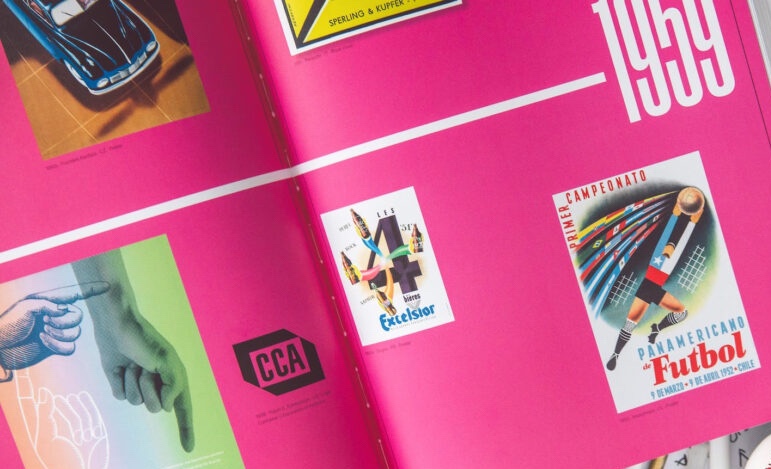
Design language ensures the brand feels cohesive whether someone is browsing a mobile app, unboxing a product, walking into a retail space, or reading a report.
Interaction Principles as Design Language
In modern interfaces, behavior is part of identity. Hover effects, scroll motion, loading states, micro-interactions—these small moments reinforce how the design language feels in action.
For example, a calm and reliable product might use soft fades and slow transitions. A bold and dynamic brand might use bouncy easing and sharp cuts.
Interaction principles should be included in design language documentation. These rules don’t just serve delight; they serve function, recognition, and differentiation.
The Role of Accessibility
A design language that isn’t accessible isn’t complete.
Accessibility guidelines should be embedded at every level—from color contrast in the palette to semantic HTML in component documentation. Beyond compliance, this is about inclusion. A brand’s design language should serve everyone, not just the ideal user.
This includes:
-
High color contrast ratios
-
Legible type sizes and spacing
-
Clear focus states
-
Keyboard navigation support
-
Motion sensitivity controls
-
Alt text and semantic structure
Design language is not about imposing beauty. It’s about designing with intention—for real people.
Modularity and Evolution
A strong design language is modular. It breaks into building blocks that can be used in new ways without breaking the system. This modularity supports experimentation, iteration, and innovation without sacrificing coherence.
But design languages are never final. They evolve. New platforms, accessibility updates, shifts in brand strategy—all these require the language to adapt. The most effective design languages are those that can stretch without snapping.
To ensure this, designers must return to the language regularly, updating documentation, expanding component libraries, and reflecting on usage patterns.
Conclusion
Design language is the connective tissue between intention and expression. It’s what allows a product or brand to be understood instantly, remembered clearly, and experienced intuitively. It turns chaotic creativity into organized impact.
We believe every organization deserves its own design language—one that reflects who they are, how they serve, and what they stand for.
Our published articles are dedicated to the design and the language of design. VERSIONS®, focuses on elaborating and consolidating information about design as a discipline in various forms. With historical theories, modern tools and available data — we study, analyze, examine and iterate on visual communication language, with a goal to document and contribute to industry advancements and individual innovation. With the available information, you can conclude practical sequences of action that may inspire you to practice design disciplines in current digital and print ecosystems with version-focused methodologies that promote iterative innovations.
Related Articles –
-

What Is Design Language? Definition and Purpose
-

Design Debt: What It Is and Why It Slows Down Innovation
-

Speeds Up Design Decisions with Grid Systems
-

Designing UI for Visceral Responses
-

Signals We Give to Users: Designing with Intention
-

When Functionality Drives a Refresh of Visual Language
-
The Power of Unified Design Language
-

The Power of Design Language: Methods, Philosophy, and Impact on Cognition
-

Design Language in Branding
-
Intricacies of Design Language and Design System