Table of Contents
Designing for Clarity, Focus, and Flow
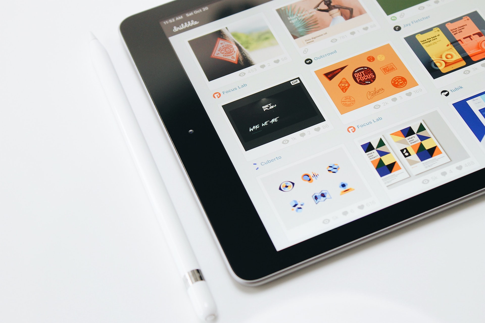
Visual hierarchy isn’t just a design technique—it’s how we guide attention, shape perception, and influence action. It’s the order in which the human eye perceives what it sees. When designed well, users don’t have to guess what’s important—they feel it.
Understanding visual hierarchy means understanding how people process information visually. We don’t read a page or screen all at once. Our eyes scan. We follow cues—size, color, contrast, alignment, spacing, repetition. Visual hierarchy leverages these cues to prioritize content and streamline navigation.
The Purpose of Visual Hierarchy
At its core, visual hierarchy serves one goal: to make information digestible.
In a digital environment overflowing with information, not everything deserves equal attention. Effective visual hierarchy organizes complexity, allowing the user to absorb, understand, and act on what they see—without unnecessary friction.
-
It helps users navigate more intuitively.
-
It helps interfaces communicate more clearly.
-
It helps brands control the narrative and tell their story with purpose.
When hierarchy is absent, even great content feels disjointed. When it’s present, even complex systems feel seamless.
Tools of the Hierarchy Trade
Designers shape hierarchy using visual contrast and positioning, often through:
1. Size and Scale
Larger elements are read as more important. Headlines, hero images, and call-to-action buttons often command size dominance because they carry the most weight.
2. Color and Contrast
A splash of bold color draws the eye first. High contrast (like black on white) makes content more legible and impactful. Designers use these tools to highlight primary actions and important messages.
3. Typography
Typefaces convey tone, but typographic hierarchy clarifies structure. Varying font sizes, weights, and styles help users scan and understand relationships between content layers—headline, subhead, body, caption.
4. Whitespace
Whitespace—or negative space—creates breathing room. It separates clusters of information and subtly suggests order. It’s not emptiness; it’s emphasis.
5. Alignment and Placement
Elements placed at the top or left are often seen first due to natural reading patterns. Alignment creates flow, while breaks in alignment draw attention.
6. Repetition and Rhythm
Repeating visual elements—icons, buttons, styles—creates familiarity. Rhythm reduces cognitive load, guiding users through a consistent visual journey.
Visual Hierarchy in UX/UI
In digital design, visual hierarchy intersects directly with usability. Interfaces that lack clarity lead to user frustration. Hierarchy helps reduce bounce rates, improve task completion, and increase time-on-site. It’s not decorative—it’s functional.
Every screen should ask:
-
What do we want the user to notice first?
-
What should they do next?
-
What can be secondary?
Designing hierarchy into a system isn’t about making something pretty—it’s about making it work.
Hierarchy and Brand Identity
Visual hierarchy doesn’t just serve UX—it reinforces branding.
How a brand organizes content reflects how it thinks and what it values. Consider the quiet confidence of a minimalist luxury brand versus the dynamic, layered storytelling of a media platform. Both use hierarchy intentionally but differently.
A brand that understands hierarchy understands how to visually say: this is who we are, and this is what matters.
Designing Systems of Hierarchy
When building out design systems, hierarchy should be embedded into every component. That means:
-
Establishing rules for headline levels, button styles, and spacing
-
Defining how priority is shown across screen sizes
-
Ensuring accessibility standards (contrast ratios, legible type, navigable structure)
Hierarchy isn’t a one-off decision—it’s a rule set. And when systems follow that logic, experiences stay cohesive at every touchpoint.
Testing Hierarchy
Great hierarchy is invisible. But poor hierarchy stands out for the wrong reasons.
That’s why user testing is essential. Tools like heatmaps and eye-tracking can validate whether users are seeing what they’re supposed to, in the order intended. If people are skipping important steps or missing calls to action, your hierarchy might need refinement.
Design That Leads the Eye
Visual hierarchy is what transforms layout into logic. It tells a silent story. It nudges the user forward. It creates a natural, effortless experience that feels intuitive—not because it’s simple, but because it’s structured with care.
In a world where attention is scarce, hierarchy is how we earn it.
Our published articles are dedicated to the design and the language of design. VERSIONS®, focuses on elaborating and consolidating information about design as a discipline in various forms. With historical theories, modern tools and available data — we study, analyze, examine and iterate on visual communication language, with a goal to document and contribute to industry advancements and individual innovation. With the available information, you can conclude practical sequences of action that may inspire you to practice design disciplines in current digital and print ecosystems with version-focused methodologies that promote iterative innovations.
Related Articles –
-

User Interface Design Starts with User Experience
-

Beyond Aesthetics: 5 Pillars of Effective Web Design Today
-

Fundamental Components of Grid Systems
-

How Grids Play a Crucial Role in Interface Design and Achieving Balanced Visuals
-

The Impact of Visual Balance in UI Design
-

Defining the User Journey in UI Design
-
Organizational Structure – What it is and Why it’s Important to You
-

The Organized UI: Prioritizing Content Through Visual Hierarchy
-

5 Fundamental Elements of Website Layout