Table of Contents
The Power of Visuals in Design
Visuals are not decoration. They are language. Images communicate faster than words, evoke emotion before logic, and influence how we perceive, process, and respond. In design, they do the heavy lifting—guiding attention, structuring hierarchy, creating meaning, and shaping experiences across physical and digital touchpoints.
Scan Context First
Before a user reads a word, they scan. What they see determines whether they stay. Whether it’s a website, product, brand, or interface—what’s perceived first sets the tone. Color, typography, scale, alignment, imagery, and motion form the foundational design vocabulary. When used intentionally, this vocabulary directs the eye, builds trust, and clarifies purpose. Used inconsistently, it introduces friction.
We process images in milliseconds. That immediacy gives design its impact. A well-constructed interface doesn’t just look good—it feels natural because its visual language is aligned with cognition, usability, and intuitive interaction.
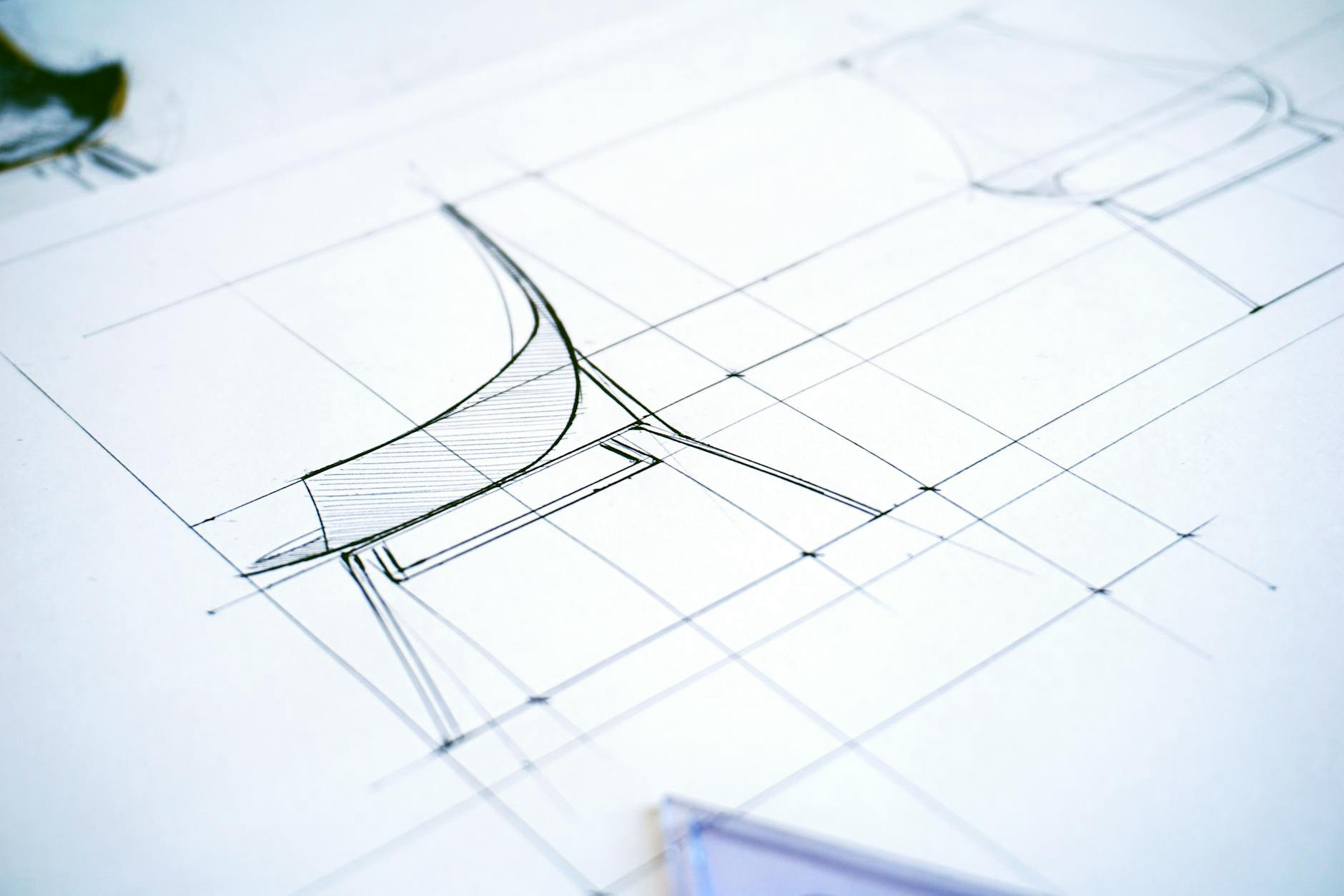
Beyond Aesthetics: Function Drives Form
Design is often misunderstood as surface-level styling. But good design is functional. Clarity, contrast, proximity, and spatial relationships determine how easily someone interprets information. Hierarchies help users prioritize. Symbols and icons reduce cognitive load. Strategic use of spacing creates rhythm and reduces overwhelm.
When design aligns with user needs, it facilitates seamless interaction. When it’s disconnected, it slows people down. That’s why consistency across layouts, platforms, and screen sizes is more than a branding exercise—it’s fundamental to usability.
Emotion, Story, and Memory
Interfaces aren’t just used—they’re felt. Color palettes, photography styles, and motion cues shape emotional reactions. These elements craft perception—whether something feels premium, playful, reliable, or approachable.
In storytelling and brand building, visual representation often says more than text. A single moment—a bold graphic, a subtle animation—can imprint a lasting impression. These impressions become memory anchors, giving people something familiar to come back to.
Inclusive Interpretation
Not everyone engages with content the same way. That’s why design must be accessible. Proper contrast ratios, alt text, scalable typography, and non-reliance on color alone are just starting points. Avoiding text embedded in images and ensuring intuitive iconography matter just as much.
Design that supports inclusivity opens access to more people across devices, environments, and abilities. It’s not optional. In modern product ecosystems, accessibility is a core requirement—not a layer added later.
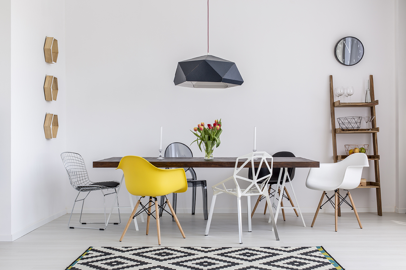
System Thinking: A Cohesive Language
Nothing exists in isolation. Each asset—buttons, headlines, illustrations, textures—needs to feel like part of the same environment. That cohesion is achieved through systems thinking. A design system helps unify typography, layout, motion, and imagery into a consistent, recognizable identity.
Consistency builds trust and familiarity. And when a system can flex across contexts—without losing its core identity—it transforms fragmented experiences into a unified brand presence. That’s why at VERSIONS®, we emphasize building scalable systems, not just static screens.
The Experience Speaks
Design is how something functions. Visual expression is how it communicates. When executed with care, it doesn’t just enhance content—it becomes content. In a digital world filled with distractions, strong design language isn’t just helpful—it’s essential.
To learn more about how visual communication supports branding, interaction, and accessibility, explore our deeper dives into Visual Communication, Visual Branding, and Design Language.
Our published articles are dedicated to the design and the language of design. VERSIONS®, focuses on elaborating and consolidating information about design as a discipline in various forms. With historical theories, modern tools and available data — we study, analyze, examine and iterate on visual communication language, with a goal to document and contribute to industry advancements and individual innovation. With the available information, you can conclude practical sequences of action that may inspire you to practice design disciplines in current digital and print ecosystems with version-focused methodologies that promote iterative innovations.
Related Articles –
-

Guide to Writing Alt Text for Accessibility
-

Click Maps and Scroll Maps: Decoding the Invisible User Journey
-
The Importance of Grids in Design
-

Design Language System: The Role, Build and Implementation
-
The Thinking Creative: 5 Ways to Get (and Stay) Creatively Inspired
-

Boosting Conversion Rate Strategies Through User Engagement
-

The Importance of a Versatile Corporate Identity