Table of Contents
Designing User Pathways
Structure, Flow, and Intentional Movement Through Digital Experiences
Digital experiences are not static pages—they are systems of movement. Users don’t just land; they navigate. They explore, click, scroll, abandon, return, and sometimes convert. This movement—deliberate or exploratory—is shaped by something deeper than just visuals or content. It’s guided by user pathways.
While user journeys tell the story from the user’s point of view, user pathways are more systematic. They are intentional routes built into the architecture of a site, app, or product that guide users toward specific outcomes. They reflect business goals, design logic, behavioral science, and interaction design—all working together to influence how people move through a digital space.
What Are User Pathways?
User pathways (also called user flows or interaction pathways) are the designed sequences of steps or screens that a user follows to complete a task or goal within a product.
They are not linear by default. Pathways can branch, loop, offer alternatives, or adapt based on behavior. Some are tightly structured (like checkout flows), while others are more open-ended (like browsing a portfolio or exploring a knowledge base).
The key difference between user journeys and pathways is this:
-
Journeys reflect the user’s experience and emotional context.
-
Pathways reflect the system’s architecture and behavioral design intended to guide users through those experiences.
Both are essential. But pathways are where design decisions are tested—and where good or bad UX is most felt.
Why User Pathways Matter
Without defined pathways, users are left to wander. This can result in:
-
Confusion or friction from poor navigation
-
Abandoned tasks or forms
-
Low conversion or engagement
-
Increased dependency on support
Designing intentional user pathways helps:
-
Reduce cognitive load and uncertainty
-
Increase task completion rates
-
Align UX strategy with business goals
-
Improve accessibility and inclusivity
-
Create repeatable, scalable interaction patterns
Well-structured pathways are the difference between a maze and a guided tour. They keep experiences smooth, purposeful, and efficient.
Examples of Common User Pathways
User pathways exist in virtually every digital experience. Some of the most familiar include:
1. Signup or Onboarding Pathways
From initial signup → confirmation → profile creation → first feature use. These pathways need to be short, clear, and rewarding to reduce drop-off.
2. E-commerce Checkout Pathways
From product discovery → cart → address → payment → confirmation. These flows balance efficiency with reassurance and data entry usability.
3. Support or Help Pathways
From clicking “Help” → browsing FAQs or documentation → contacting support. These flows must prioritize clarity, searchability, and emotional reassurance.
4. Learning or Content Discovery Pathways
From homepage → topic navigation → article → related resources. These flows emphasize engagement, readability, and lateral movement across topics.
5. Application Flows
From dashboard → feature access → configuration → action → feedback or result. These are core to SaaS and enterprise platforms, often requiring deep UX thinking and responsiveness to user roles or permissions.
Each pathway is an ecosystem of micro-decisions, cues, layouts, and options. Designing them well means orchestrating clarity without limiting autonomy.
The Anatomy of a User Pathway
Whether linear or nonlinear, every user pathway consists of key structural elements:
-
Entry Point: Where does the user begin? This could be a landing page, search result, email, or menu click.
-
Decision Points: Where do users choose between options? These points should be contextually supported (e.g., CTA copy, visual hierarchy).
-
Interaction Steps: What actions are required? Forms, filters, toggles, buttons, etc.
-
Feedback Loops: How does the system respond to user input? Confirmations, progress indicators, or error messages.
-
Exit or Goal: Where does the pathway end? This could be a completed task, a confirmation page, or another branching pathway.
Designing pathways is not just about drawing lines on a flowchart. It’s about designing behavior and response, anticipating user intent, and minimizing friction along the way.
Designing User Pathways: Core Principles
1. Clarity Over Choice
While freedom is important, too many options can lead to analysis paralysis. Each pathway should offer clear next steps. Think progressive disclosure—only show what’s relevant at the moment.
2. Contextual Cues
Users need to know where they are, what they can do next, and what happens after. Breadcrumbs, highlighted states, and consistent labeling provide that context.
3. Consistent Patterns
Interfaces should reuse recognizable components across pathways. This builds trust and reduces learning curves. For example, a “Continue” button should always look and act the same.
4. Efficient Feedback
Every interaction should have a reaction. Microinteractions—like loading states, confirmations, or validation—keep users informed and confident.
5. Accessibility and Inclusivity
Pathways must work for all users. This includes those using screen readers, keyboard navigation, or mobile devices. Accessibility is not an add-on—it’s a foundation.
6. Branching by Behavior
Users don’t always follow the ideal flow. Design for exceptions—account for “back” clicks, wrong turns, or decision reversals. Provide alternate paths that support recovery.
Mapping and Prototyping User Pathways
Before building pathways into a product, map them visually and test them in low-fidelity environments. Here’s how:
1. Define the Goal
What task or outcome should the pathway lead to? (e.g., schedule an appointment, upload a file, view analytics)
2. List the Steps
Break down the process into discrete screens or actions.
3. Identify Interactions
Map out what input the user provides and what the system returns.
4. Sketch Decision Points
Where can users diverge? What if they change their mind?
5. Prototype and Test
Use tools like Figma, Adobe XD, or code-based prototypes to simulate the experience. Run usability tests to validate clarity and flow.
Mapping these out ensures that your digital experience feels intentional—never random.
Pathways Across Different Modalities
User pathways adapt based on context:
-
Web: Mouse, keyboard, and visual layout dominate. Hover states, menus, and scroll interactions matter.
-
Mobile: Touch, gestures, and limited screen real estate change how information is layered and presented.
-
Voice UI: Interaction is sequential and audio-based. Clear structure and response timing are crucial.
-
Kiosk or Embedded UI: Contextual simplicity and clear labeling help when users engage briefly or without guidance.
-
Cross-platform: Seamless continuity matters. If a user starts a process on desktop, they should be able to finish it on mobile.
Designers must account for affordances, limitations, and expectations unique to each modality—especially when users switch between them.
Measuring the Effectiveness of User Pathways
Building a pathway isn’t the end—it’s the start of an ongoing process. Key metrics include:
-
Completion Rate: How many users complete the flow?
-
Time on Task: How long does it take?
-
Drop-off Points: Where are users exiting or hesitating?
-
Error Rate: How often do users need to retry or request help?
-
Satisfaction: What qualitative feedback do users share?
Use tools like funnel analysis (Google Analytics, Mixpanel), session recordings (Hotjar, FullStory), and usability testing to gather this data. Iterate based on insights—not assumptions.
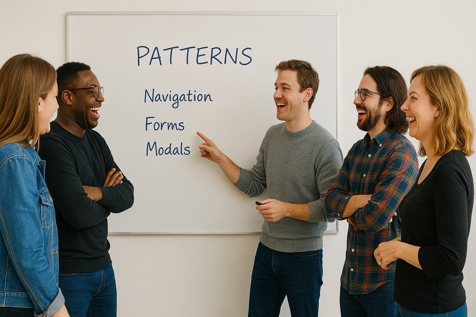
User Pathways and Design Systems
Scalable products rely on repeatable patterns. That’s where design systems come in. A good system includes:
-
Components: Buttons, modals, inputs—each optimized for flow.
-
Guidelines: When and how to use each component.
-
Templates: Standard flows for onboarding, login, etc.
-
Accessibility Standards: Ensuring all pathways are inclusive.
Pathways should not be reinvented from scratch each time. Design systems offer consistency, efficiency, and a shared language across teams.
Pitfalls to Avoid in Pathway Design
Even experienced teams can fall into these traps:
-
Too many steps: Users abandon processes that feel excessive or repetitive.
-
Unclear microcopy: Labels like “Submit” or “Next” without context frustrate users.
-
Ignoring edge cases: Not all users follow the same logic or sequence.
-
Designing only for conversion: Pathways should support exploration, education, and support—not just sales.
-
Over-reliance on assumptions: Behavioral data and user testing should shape flows, not internal logic alone.
Avoiding these mistakes requires humility, curiosity, and constant iteration.
Structure Is Not Restriction
User pathways are not about controlling users—they’re about supporting them. A well-designed pathway feels natural, not enforced. It offers guidance, not guardrails.
In the best cases, users don’t even notice the design. They just flow—from intent to action, from curiosity to clarity. That’s the power of a good pathway: it disappears into the background, letting the experience speak for itself.
Designers don’t just build screens—they build movement. And every movement needs a path.
Our published articles are dedicated to the design and the language of design. VERSIONS®, focuses on elaborating and consolidating information about design as a discipline in various forms. With historical theories, modern tools and available data — we study, analyze, examine and iterate on visual communication language, with a goal to document and contribute to industry advancements and individual innovation. With the available information, you can conclude practical sequences of action that may inspire you to practice design disciplines in current digital and print ecosystems with version-focused methodologies that promote iterative innovations.
Related Articles –
-

How to Spot Usability Problems on a Website
-
Designing for People
-
The Invisible Weight: How AI Tools Add to Our Mental Load
-

A Unified Workshop Method for Digital Transformation
-

How to Run a Focus Group Workshop for UX and Design Insights
-

Making Sense of Structure: How Card Sorting Shapes Intuitive UX Design
-

Design and Familiar Pathways in UX
-
Designing with Interaction Patterns: Creating Consistency and Flow in User Experiences
-

Why Empathy: The Day I Learned to See
-

Progressive Disclosure: The Art of Revealing Just Enough