Table of Contents
Navigating the Web Design Spectrum
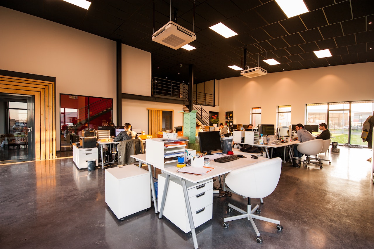
Web design is often the first touchpoint between a brand and its audience. While development powers the engine, design drives the user experience. Choosing the right approach to web design means evaluating goals, resources, audience expectations, and long-term maintenance needs. And in today’s crowded digital landscape, not every site needs to be built the same way.
Understanding the Landscape: No One-Size-Fits-All
Modern web design options vary widely, from highly customized design systems to pre-built themes and no-code solutions. The most effective websites are those that match the complexity of the solution to the goals of the organization. Designing for a fast-moving startup, a global nonprofit, and an ecommerce platform requires fundamentally different starting points—not just in look and feel but in how the experience should perform.
Custom Design Systems
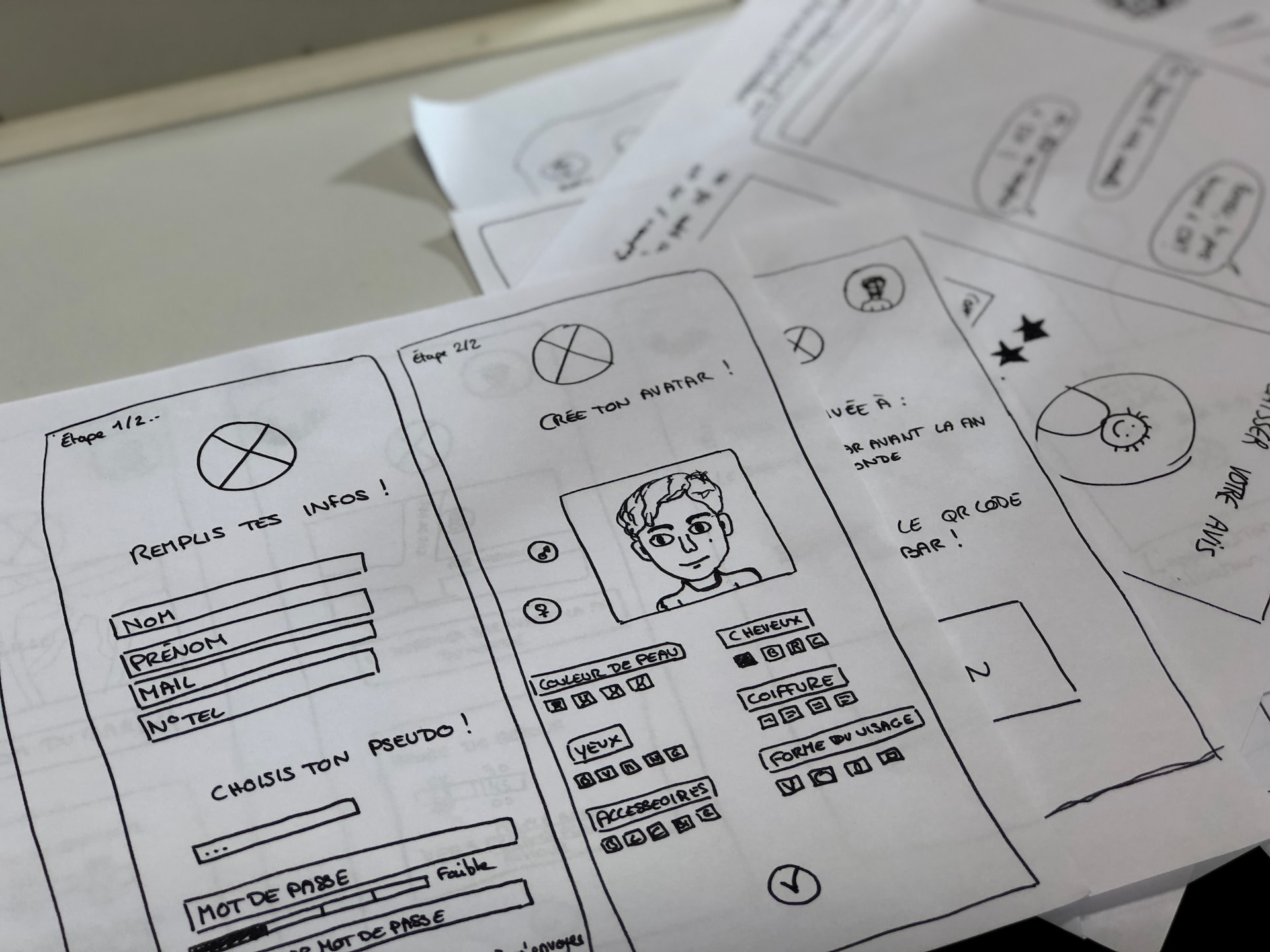
At the high end of the spectrum lies custom web design. These systems are built from scratch around a brand’s unique identity, usability needs, and digital strategy. Custom design allows for complete visual and functional alignment, often web developed in parallel with a component-based design system that ensures scalability and future growth.
When to choose this:
- Enterprise-level brand presence
- Unique user experience requirements
- Multi-channel marketing or product ecosystems
- High focus on accessibility, internationalization, or compliance
Benefits:
- Tailored UI/UX aligned with strategy
- Future-proof architecture
- Clean handoff to development and long-term maintainability
However, custom design demands significant time, budget, and collaboration between stakeholders, designers, and developers. It thrives when there’s organizational alignment on vision and execution.
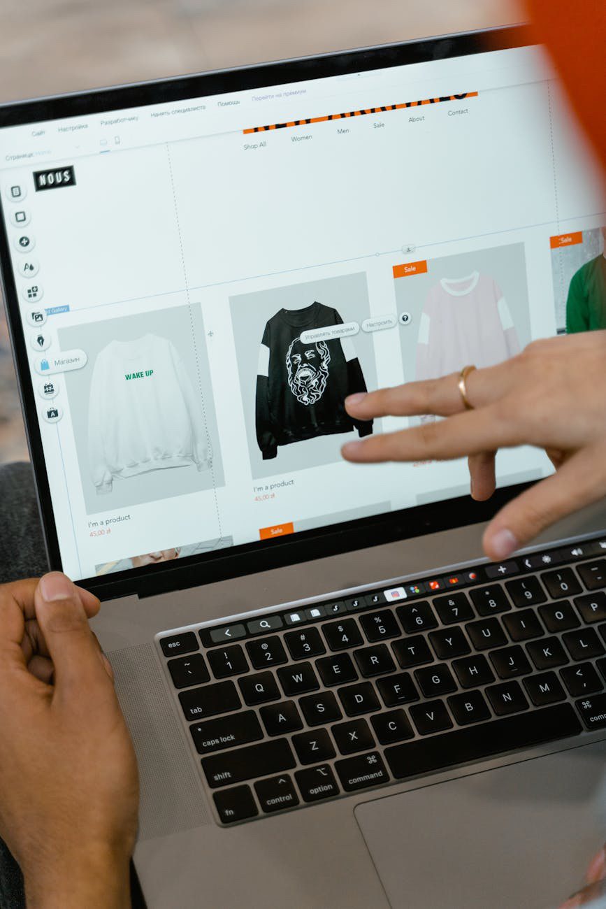
Templated Solutions and Theme Customization
For businesses with more modest requirements or constrained timelines, theme-based design—especially on platforms like WordPress, Shopify, or Webflow—offers a structured, affordable path to getting online fast. Templates can be modified with brand colors, fonts, and content to approximate a custom feel without the complexity of building from scratch.
When to choose this:
- Small businesses, startups, and solo creators
- Quick launch requirements
- Limited internal technical resources
Benefits:
- Faster time to market
- Lower development costs
- Access to built-in plugins and support communities
That said, templated solutions come with trade-offs. Many are overbuilt, bloated with unnecessary features, or rigid in their structure. And because templates are often used by many others, brand differentiation can suffer without thoughtful customization.
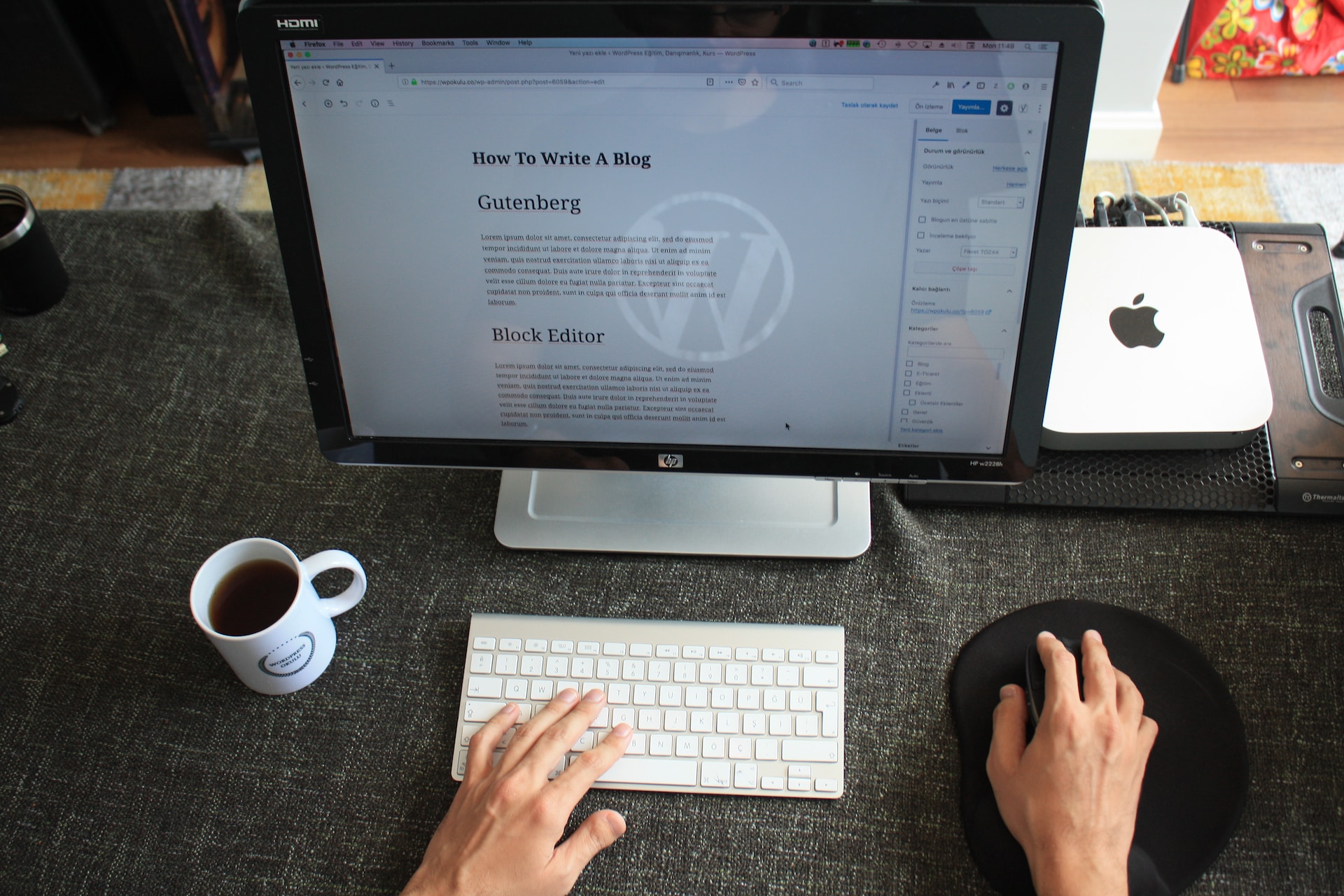
Design via Page Builders and No-Code Platforms
Visual builders like Elementor, Divi, Webflow, and Squarespace empower designers and marketers to create and update pages without writing code. These platforms have democratized web design by making it more accessible, lowering the technical barrier to entry.
When to choose this:
- Marketing teams seeking autonomy
- Content-driven websites needing frequent updates
- Organizations without in-house developers
Benefits:
- Real-time editing and visual control
- Faster testing and iteration
- Integrated hosting and performance tools (in many cases)
However, no-code tools require discipline. Over-styling, inconsistent spacing, and plugin overload can impact performance and accessibility. When used with clear design systems and editorial guidelines, though, these platforms can be highly effective.
Adaptive vs. Responsive Design
Responsive design—websites that adapt fluidly across screen sizes—has become the standard. But depending on the audience, an adaptive approach, where different layouts are specifically designed for breakpoints, may provide better control over content hierarchy and UX.
Responsive:
- One layout that fluidly resizes across devices
- Easier to maintain; less code duplication
Adaptive:
- Multiple fixed designs triggered by device or screen size
- Higher level of control, but more design and QA effort
The right choice depends on content complexity, visual hierarchy needs, and available resources for testing and support.
Web Design That Works with Development
Regardless of the option chosen, good design can only succeed if it integrates seamlessly with development. Bloated designs that ignore feasibility or accessibility standards can hinder speed, SEO, and usability.
Whether using component-based frameworks (like Atomic Design or Tailwind UI) or modular design systems built in Figma and implemented with React or Vue, the goal is a consistent handoff and reduced design-debt over time.
Communication between design and dev teams ensures that:
- Design intentions are faithfully implemented
- Accessibility features are preserved
- Interactive elements are responsive and intuitive
Performance and User-Centered Decisions
Today’s web users expect fast, intuitive, and visually engaging experiences. Performance isn’t a bonus; it’s part of the design brief. Web design options must be evaluated through this lens:
- Is this layout efficient to load?
- Does the interaction feel immediate?
- Are visual choices inclusive and accessible?
Design decisions must also reflect the needs of real users. Who is visiting the site? What are they trying to achieve? How do they navigate? Design options that look great on a mockup but create confusion in practice are not effective.
Making the Right Choice
Choosing the right web design approach isn’t about chasing trends. It’s about aligning intent with execution. Consider:
- Brand maturity: Is this a new venture or a mature brand?
- Team structure: Are there designers and developers in-house?
- Update frequency: Will the site be static or require ongoing updates?
- Performance priorities: Will the site be used internationally, on mobile, or in low-bandwidth areas?
Final Thought
Web design is a strategic decision, not just an aesthetic one. Whether you invest in a fully custom experience or launch with a tailored template, what matters most is clarity of intent. The best design choice is the one that serves your users, aligns with your goals, and respects the resources you have to maintain it.
Our published articles are dedicated to the design and the language of design. VERSIONS®, focuses on elaborating and consolidating information about design as a discipline in various forms. With historical theories, modern tools and available data — we study, analyze, examine and iterate on visual communication language, with a goal to document and contribute to industry advancements and individual innovation. With the available information, you can conclude practical sequences of action that may inspire you to practice design disciplines in current digital and print ecosystems with version-focused methodologies that promote iterative innovations.
Related Articles –
-
A Systematic Analysis of User Interface Problems
-
The Role of Information Architecture in Web Design: Categories and Tags
-

5 Tips for Designing Sites with User Experience In Mind
-
Four Rock Solid Guidelines for Designing Mobile Friendly Magento Commerce Layouts
-
Web Redesign to Accommodate Mobile Dominance
-
Know Your Options
-

Changes on the Web in the last Five Years
-
User and Experiences on the Web